Pages


Showing posts with label intense black. Show all posts

Friday, July 9, 2010

Spacer Madness

 It's been too hot to do a lot of torching this week.  Normally, I do a little bit every day and try to get listings up as they are ready.  This has not been such a week.  I decided to follow the lead of many other lampworkers and give it a rest, to cut down on energy usage and increase my own comfort.  A side benefit of this plan has been that I have had the time to go through my to-do list and actually do some of it.  Many items I have been meaning to list have been listed, including some of the countless spacers that seem to multiply as I look at them.
 Above is a set of black and white that I made with various blacks and Effetre white pastel.  The only bead I can absolutely state was made with a specific black was the white one near the center, which was made with intense black stringer.  The black stands out so well it can only be that.  Everything else might be Vetrofond black or CiM tuxedo, or even CiM hades.  I know I didn't use Effetre black, because I have never bought any.

The blue and white ones at the right were made with Effetre 060 cobalt and Effetre white.  I love blue and white and seem to have made quite a few of these.
Here are two cylinders made with Effetre lapis cobalt and one of the trans cobalt, all with white stringer.  I was wondering if I should stick to just cylinders or throw in a few bicones and rounds as well.  I'm still thinking and may modify this listing.
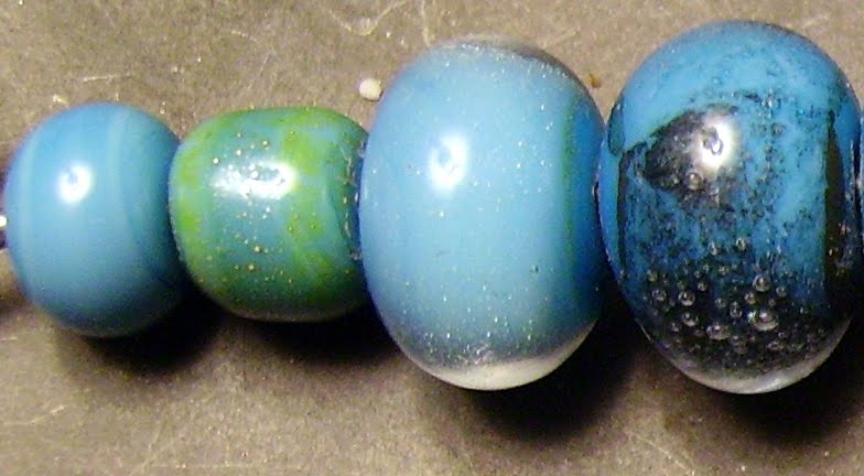
I wanted a blue less likely to be mistaken for black with these and went with Effetre pastel light cobalt with these.  I like the way they are still very blue but are a softer contrast.
Here are some made with CiM hades on Vetrofond dark ivory pastel.  I love the way the hades curdles and webs over the ivory.
I've played with ivory and turquoise a lot, but not silvered ivory.  I love the way the silvering takes the reaction between the two past its usual grey line and out the other side.  I'm going to try this on some of the greens as well.  I was thinking of CiM sherwood and Effetre copper green and Nile green.
These came out so awesome.  I love the way the Vetro dark ivory curdles when you melt DH Triton into it, and you get a halo reaction also that is also fab.  It reminded me of ancient writing on stone, hence the name, petroglyphs.
This is one of the new Vetrofond colors, biscotti, with scrolls of Triton which were melted in and reduced.  The Triton fumes the biscotti to a huge degree and there is another neat reaction line around the Triton.  The combined effect gave me the impression that the designs had been burned into the beads so I had a little fun with the name, smoldering runes.
The weather is supposed to break soon, so I'll be back at the torch in no time.  I might just make more spacers....

Thursday, April 29, 2010

CiM butter pecan

A while back I reviewed CiM ginger and made a comparison bead with butter pecan, which was pretty identical with the rods I chose. There is quite a bit of variability in both these colors, and the rod color has a lot to do with the color the finished beads turn out. Butter pecan is a good pink to choose for human sculptural forms (think caucasian goddesses and angels) with the warning that it does get pretty drippy. Not quite as soft as ivory but close, and it stays hot for a long time. In the packet of glass I received, there was a lot of variation in rod size, the one I chose to do tests being about 4mm and the largest 7mm.

Plain butter pecan is creamy with an ever so slight streakiness that disappears if the bead is worked at all. With silver foil there is some yellow fuming, but not as much of a surface reaction as I was expecting. I don't really care for the pearly effect reducing the silver and encasing it has here.


What I do dig is the combination of copper leaf and butter pecan. I will be making some sort of beads with this. The iridescent blue of reduced triton looks nice against the neutral background, but I don't really care for the dark chrome of triton without the dots of clear.


Butter pecan is supposed to be a less reactive alternative to ivory and I wanted to do a test bead to see how close they were. I don't think they are very close, but particularly with a test I did on nile green opalino, the test bead may not indicate what really happens when other colors are involved.

I tested butter pecan with tuxedo in the middle and intense black on the right to see which, if either, would web and what would happen. Tuxedo and butter pecan are about the same degree of softness when melted, so each pretty much kept to itself. Intense black stayed crisp on the butter pecan, but webbed the dots of butter pecan on top like crazy.


Plum silver does pretty well on butter pecan, developing a nice lustre and not having too bad an edge reaction. Copper green does form a slight grey line, but not as bad as on some other colors. EDP bleeds like crazy when placed on top of butter pecan, and the way the butter pecan forms a clear dot in the middle is wild.


I'm glad I have this color in my palette and will be buying more when I run out. I am thinking of some seaside themed beads and I think this color will be one of the main ones I will be using.


Wednesday, April 28, 2010

Effetre nile green opalino

Effetre nile green opalino wasn't available for a while, and having worked the others, I was anxious to give this a whirl. It is a nice, spring green that I think works best by itself. It remains stiff when worked, more toward the transparents than the opaques. I found myself constantly resisting the urge to work lower in the flame or turn up the gas, since this color is ridiculously sensitive to torch chemistry and if the flame is too reducing, the beads will go an ugly, greyish olive with "smoke" spots on them. If they had beed surface flaws, I might have tried etching to remove the discoloration, but the glass was stained all the way through so I threw out a couple beads where I wasn't able to resist temptation.

Plain, these are a nice, jade green that becomes more ethereal when encased in clear. Note the lack of a clear dividing line where one glass starts and the other stops. Following Pat Frantz's advice, all the encased beads were made on a core of clear to prevent cracking, which the opalino colors are supposed to be prone to do when encased.


Application of metal is a way to shift the hue of this green toward yellow or blue. Adding either does affect the surface, which must be taken into account, but the silver definitely shifts the glass strongly toward the yellow end and copper sends it equally decisively toward the blue. Both have tiny bubbles on them, with the copper being more noticeable.


Double Helix aurae doesn't do well on this glass and I doubt I will do this again. It is interesting the way the unencased bead has separation of the aurae.


I wanted to compare the effects of ivory and CiM butter pecan on a real bead and found they were similar. Both separated a bit, with the ivory on the left separating more strongly, and both are about the same shade. I thought the green glass would react with the ivory to produce a grey line, which it didn't, so I will have to compare them again on a color which I know does.


CiM tuxedo reflects quite a bit into the opalio, and the opalino dots on top of it are invisible. I ran out of gas just as I made the middle bead with intense black, but I believe the tiny opalino dots on top of the intense black ones would have been a waste of time. I was pleased that Gelly's sty didn't do anything weird with the opalino, since I may do something in a muted floral with these two.


I would probably buy this glass again. It is a color that does not really appear in the other manufacturer's lines and will make nice beads as long as I don't forget what it can and can't do.


Sunday, April 25, 2010

CiM smurfy

Creation is Messy smurfy is amazingly well behaved. Up until now I've only used Effetre 236 dark turquoise and never saw any reason to do otherwise. Now I doubt I will use it again. Smurfy is not an exact match for the color; the Effetre 236 is a tad darker. Smurfy is a bit streakier, especially if the bead is simply wound and finished, as I usually do. There is no boiling and this glass is so much easier to work. I did have an issue with the flame on my HotHead reducing the first bead I made, but this was due to a problem with how the torch was attached to the new tank. I was very glad I was using a turquoise, since the minute it went brick red I knew I had a problem and was able to correct the reduction issue and go back to torching.

Plain, smurfy is a nice, medium turquoise with some streaks, which aren't a problem for me, and absolutely no pitting. With silver on its own there is some yellow fuming, which may work in a specific application that I can't imagine at the moment. The same bead reduced was neat to look at, but the minute I encased it, there was nothing to indicate that silver was ever there. With copper, there is a neat blue-black film and some less-neat bubbles under encasement. Without encasement the copper leaf looks like burned rice paper.


Considering what happened to the silver, I didn't think I'd like the Double Helix aurae, but I'm glad I tried it. Under encasement, there is an attractive, subtle rainbow that goes well with the turquoise. Without encasement, the gold makes a nice contrast.


None of the color reactions surprised me. From left to right are light (?) yellow pastel, ivory, EDP, red roof tile (which didn't do the dark orange to yellow fade I was hoping for), intense black, and plum silver.


I will be buying this glass when my current supply runs out, because even if it costs a few pennies more, it is so much easier to use I will save it in aggravation.


Wednesday, April 21, 2010

CiM Gelly's sty

Another CiM color that almost slipped by me. They have so many, I'd go broke trying to own them all, but I'd love to try. This one is really a unique shade of pink. It is slightly translucent, but this is part of its charm. Effetre rose opalino is similar, but it is a pain to work with and Gelly's sty doesn't need to be struck. I think the best thing about it is that it plays so well with other colors. The material from Creation is Messy says that it goes light under encasement and likes to be worked hot. There are reports that it can be shocky (oh, no) and devitrifies. I was forewarned on the shockiness and as far as the devitrification goes, I'll just have to see.


Plain reveals a pretty, rose petal shade of pink. Encased, it looks pretty much the same to me. Perhaps a tiny bit more translucent. Maybe a good thing. If I want an ethereal pink, this is the color for me.


I didn't even bother testing this one with silver or copper, since I knew it would go all yellow with silver and I have yellow opalino and CiM ghee for that. With copper I just wasn't interested. I suspect the shockiness advised against comes after cooling without kilning so we'll just see how the plain encased bead does before I add copper to the mix. With DH aurae, pictured here, it goes golden and highlights the gold dots of the aurae. Nice. I love what it did under encasement. I only wish my clear didn't scum up.


The translucent quality of Gelly's sty is really highlighted by its use with CiM tuxedo. The tux seems to be slightly absorbed by the pink, but that is light transmission, because the edges of the black on pink are nice and crisp. The pink on black looks slightly lavender. I have to try encasing a tux bead with Gelly's sty now. EDP bled a little but works well on this pink. No burning! I really like that there is no reaction with ivory. I was sure there would be. The dots of pink on top disappear on both the ivory and the white next to it. Gelly's sty is fairly stiff for an opaque, so that explains the ivory and white bleeding.


Yellow seems to bleed a little but there is no ugly reaction. Strangely, copper green appears bleached out. there is nothing ugly happening here and I would feel confident using the 2 together, but I would wish for more contrast. The intense black stays crisp and the Gelly's sty separates into that neat mouth thing, but it is almost invisible due to its lack of saturation. Trying to get plum silver to go metallic without devitrifying was a task beyond me, but there is a hint of a shimmer, trust me.

I will definitely be buying more of this color. It is a pleasure to work with and an unique addition to my palette.


Monday, April 19, 2010

Vetrofond pearl grey

I've been on bed rest for almost a week and these posts represent me rounding up the pictures of beads that I made previously and haven't had a go at yet. This is a color that I didn't think I'd like at all in rod form but was pleasantly surprised at with the finished beads. The rods melt nicely and the color makes a pleasant background against everything except silver and Double Helix glass.


The first bead is plain for comparison. When I had made this, I noticed that the end of the rod nearest the melted section had gone whitish without devitrifying, so I had to try to do this on purpose. The bead on the right is this attempt. I think it looks a little lighter. This glass reminds me of CiM glacier a lot.


With silver and the DH glasses psyche and Aurea, the yellowish fuming spoils it for me. I do like it with copper leaf, encased in clear. This is the bead in the middle.


This plays well with other colors, especially the copper green, producing a nice spring palette. The bead in the middle with the intense black layered dots looks pretty neat. I'm not as fond as the same effect with EDP.

I don't know if I would buy this color again or CiM glacier. For my purposes the two are nearly interchangeable.


Sunday, April 18, 2010

Effetre dark pumpkin

These are the only beads I made with this color, because they represent an entire rod of this super shocky color. I got tired of chasing hot chunks of flying glass shards and quit while I still had a "studio." I will say right off the bat I will not be buying this color again, ever. I preheated the heck out of it in every way I knew and it still exploded, and not just in the rod end pops off kind of way but shards flying all over the place. I had a tough time even getting the end of the rod hot enough to start winding it, instead I held pieces in a pair of needle nose pliers and more or less stuck them to the mandrel. Making beads was not a pleasant experience and if this was the first color I worked with, it would have been the last. Strangely enough, this came out as zucca scuro in the "silver challenge" bundle released in December and that rod didn't do this. I am just not willing to risk burning myself or my abode any more.

That having been said only 2 beads are even remotely worth it: the bead in the middle is with dots of DH psyche, melted in and reduced, and the one on the right which is dots of intense black and dots of dark pumpkin on top (this was very tricky to make.) While I like the way both of these turned out, the place can't take another go at trying to make more.

Others may have had other experiences with this color and are welcome to tell me about them in comments, even link in your pictures if you can figure out how.

Saturday, April 17, 2010

Effetre chocolatta


OK, when I blogged CiM adamantium, I said it was a milk chocolate color.  I didn't know what I was talking about.  This is the chocolate brown.  I could put these in a bowl with candy and be doing the Heimlich maneuver in no time.  The glass melts like chocolate, too.  Perhaps that is why I forgot I had made a bunch of beads and made them again.  I was having too much fun.

With metal it's not impressing me, but who cares.  For the purpose of thoroughness, left to right are plain, with silver foil, same encased, and copper leaf.


With DH aurae and triton, I'm not too happy, but psyche looks promising in a raspberry truffle kind of way.


Plum silver looks kinda nice, like spots of dark chocolate, but copper green is unfortunate, since I could have gone for the whole chocolate and mint thing.  EDP separates the chocolatta, which is a shame. 


Ivory separates the chocolatta, as well, but I'm getting used to it bleeding or separating or forming a line.  Same sort of thing with intense black and CiM tuxedo.


I love this color and will be gobbling it up, so to speak, so I'm sure I'll buy it again.  Only the frustration of trying to use this laptop is keeping me from further raptures.

Friday, April 16, 2010

Effetre light pumpkin

I had to be very careful with labeling these, since I received a large number of oranges all at once and they all look nearly identical in rod form. This is one of the new colors from Effetre, light pumpkin, originally zucca chiaro. It strikes from yellowish to orange tan.


I didn't get much out of adding metal to these beads, either silver foil or copper leaf. I'm not sure how many orange and brown textural beads I'm going to be making.


Double Helix glasses look neat on this color, with a surprisingly dark aurae on the left, then triton, encased psyche looking the best I've achieved yet, and finally psyche on its own.


The EDP does react a bit with the pumpkin but I can live with this. The combination is appealing in a strange way. Intense black stays nice and crisp but there is some separation of the top dots of orange. The grey line forms on the copper green. Sis just plain bleeds all over. Plum silver seems to prevent color development in this just like it did with the red roof tile.

This is a nice, bright, happy pumpkin orange that will come in handy around Haloween.


Thursday, April 15, 2010

Effetre apple blush

First I would like to say that I like the name for this color much better than when it came out in a sample pack in December. It was originally Gaillo ocra. My miserable Italian and sense of humor translated it into "yellow chicken" for a reason that I may never know. The color is a bit like a green apple or underripe mango. It melts well and plays very nice.
The plain bead shows the reason behind the name blush. The usual brownish textural thing with melted in silver foil, and I love the shades of lilac that happen when the same thing is reduced and encased. Copper leaf on its own is ugly, and this bead is one of the reasons I am no longer doing this test. Under encasement the copper leaf looks pretty neat.

I like this with Double Helix glass. The one on the left is aurae, and melting it in and reducing it makes a very nice gold tone, with attractive fuming on the edges. Encase it and you get lavender! Psyche didn't turn out well, but I think I was running out of gas. Triton on the right looks nice under encasement, but I still like the aurae better, especially against the green.


Intense black stayed crisp while EDP and ivory bled. Nice contrast with the EDP and lime green.

Would I buy this color again? Probably. I have a lot of greens but there's always room for one more.

Saturday, April 10, 2010

Effetre Neptune

Neptune is one of the new colors from Effetre that looked very promising in the catalog. My beads are no where near as nice as the ones pictured by others, but I really like this color.
In the rod it reminds me very strongly of CiM mermaid, in fact labeling would be an issue if the rods weren't so irregular. Obviously a hand pulled color. One of them is almost 10mm and all are a little lumpy. This I don't mind. It is supposed to develop a silver metallic lustre, except under clear. Clear removes this lustre, even if it is well developed when the clear is applied. I tried to do a plain bead without lustre and one with, by working it high in the flame as I would plum silver. The one on the left is wound and that's it, and I allowed the one on the right to cool a little and reheated it gently. I think there is a little change but not as much as I could have hoped.

Under clear, the change is striking. The bicone is just Neptune and clear, the oval is with Effetre whisper because I wanted to see if it would do anything weird under a gold pink and wanted to be able to see it if it did. The cylindrical bead is rolled in silver foil, melted in and trailed with clear. I don't see a whole lot of difference between the beads at all.


Does Neptune play nice with others? Pretty much. Intense black bled, and I put dots of clear on the top of the top dots of Neptune so I could see what was happening underneath. EDP looks nice but the Neptune dots get kind of lost over the EDP and under the clear. I didn't dot the Neptune over the ivory because I knew there would be that grey line and wanted to see what happened to the ivory with all that green around. It held its own.


Copper leaf accentuates the lustre process, and gives a lustre-like effect under clear. Good to know, but I didn't do a very good job of encasing, did I?


I made a couple wee beads just for fun and am happy about the way the one on the left, with triton and clear turned out. I'm not so happy how the one with plum silver and clear turned out, but what did I expect. I did learn that plum silver dark is indistinguishable from the Neptune once it is struck. I don't know what I was trying to do with the tiny dots of clear, but it didn't work, whatever it was.


Will I buy this color again? Yep, and I will play lots more with the lustre glasses from Double Helix.