Here they are


 This is one of the new Vetrofond colors, biscotti, with scrolls of Triton which were melted in and reduced. The Triton fumes the biscotti to a huge degree and there is another neat reaction line around the Triton. The combined effect gave me the impression that the designs had been burned into the beads so I had a little fun with the name, smoldering runes.
 A while back I reviewed CiM ginger and made a comparison bead with butter pecan, which was pretty identical with the rods I chose. There is quite a bit of variability in both these colors, and the rod color has a lot to do with the color the finished beads turn out. Butter pecan is a good pink to choose for human sculptural forms (think caucasian goddesses and angels) with the warning that it does get pretty drippy. Not quite as soft as ivory but close, and it stays hot for a long time. In the packet of glass I received, there was a lot of variation in rod size, the one I chose to do tests being about 4mm and the largest 7mm.
 Plain butter pecan is creamy with an ever so slight streakiness that disappears if the bead is worked at all. With silver foil there is some yellow fuming, but not as much of a surface reaction as I was expecting. I don't really care for the pearly effect reducing the silver and encasing it has here.
 What I do dig is the combination of copper leaf and butter pecan. I will be making some sort of beads with this. The iridescent blue of reduced triton looks nice against the neutral background, but I don't really care for the dark chrome of triton without the dots of clear.
 Plum silver does pretty well on butter pecan, developing a nice lustre and not having too bad an edge reaction. Copper green does form a slight grey line, but not as bad as on some other colors. EDP bleeds like crazy when placed on top of butter pecan, and the way the butter pecan forms a clear dot in the middle is wild.
 Effetre nile green opalino wasn't available for a while, and having worked the others, I was anxious to give this a whirl. It is a nice, spring green that I think works best by itself. It remains stiff when worked, more toward the transparents than the opaques. I found myself constantly resisting the urge to work lower in the flame or turn up the gas, since this color is ridiculously sensitive to torch chemistry and if the flame is too reducing, the beads will go an ugly, greyish olive with "smoke" spots on them. If they had beed surface flaws, I might have tried etching to remove the discoloration, but the glass was stained all the way through so I threw out a couple beads where I wasn't able to resist temptation.
 Plain, these are a nice, jade green that becomes more ethereal when encased in clear. Note the lack of a clear dividing line where one glass starts and the other stops. Following Pat Frantz's advice, all the encased beads were made on a core of clear to prevent cracking, which the opalino colors are supposed to be prone to do when encased.


 CiM tuxedo reflects quite a bit into the opalio, and the opalino dots on top of it are invisible. I ran out of gas just as I made the middle bead with intense black, but I believe the tiny opalino dots on top of the intense black ones would have been a waste of time. I was pleased that Gelly's sty didn't do anything weird with the opalino, since I may do something in a muted floral with these two.
 Creation is Messy smurfy is amazingly well behaved. Up until now I've only used Effetre 236 dark turquoise and never saw any reason to do otherwise. Now I doubt I will use it again. Smurfy is not an exact match for the color; the Effetre 236 is a tad darker. Smurfy is a bit streakier, especially if the bead is simply wound and finished, as I usually do. There is no boiling and this glass is so much easier to work. I did have an issue with the flame on my HotHead reducing the first bead I made, but this was due to a problem with how the torch was attached to the new tank. I was very glad I was using a turquoise, since the minute it went brick red I knew I had a problem and was able to correct the reduction issue and go back to torching.
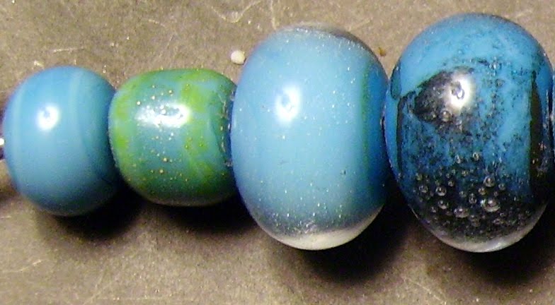 Plain, smurfy is a nice, medium turquoise with some streaks, which aren't a problem for me, and absolutely no pitting. With silver on its own there is some yellow fuming, which may work in a specific application that I can't imagine at the moment. The same bead reduced was neat to look at, but the minute I encased it, there was nothing to indicate that silver was ever there. With copper, there is a neat blue-black film and some less-neat bubbles under encasement. Without encasement the copper leaf looks like burned rice paper.
 Considering what happened to the silver, I didn't think I'd like the Double Helix aurae, but I'm glad I tried it. Under encasement, there is an attractive, subtle rainbow that goes well with the turquoise. Without encasement, the gold makes a nice contrast.
 None of the color reactions surprised me. From left to right are light (?) yellow pastel, ivory, EDP, red roof tile (which didn't do the dark orange to yellow fade I was hoping for), intense black, and plum silver.
 I only made a few beads each of the two new transparents from Effetre, mostly because I seem to enjoy working with the pastels and specials more. On the left is green rosette, a very dark emerald green that stands up well in thin layers. The self bead first on the wire is almost black, and it is only near the hole that you can see it isn't. Over clear, green rosette looks about as dark as the next color down, dark teal is. I think dark teal is quite a bit more blue, but would have to dig too far to find out. Over white, the green rosette is applied very thinly indeed and really is staying dark. The line going around the bead is not a crack, it's where i overlapped incompletely when winding on the color. Over ivory, I believe there is just a hint of a grey line, but nothing too glaring.

 Lately, I've been going through my stash of beads and photos and publishing some of the ones that got away. This is such a one, although I don't know why it did, because it's purple! The color is Effetre light violet transparent, which is a premium color, but I don't know why because it is machine pulled. Regardless, it is a nice shade that is sufficiently different from their amethyst color to merit a separate purchase. It melts very slowly, resists thermal shock and remains very stiff when working.
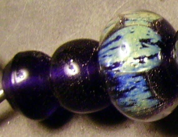 Plain, it appears very dark indeed, which makes me wonder if there was ever a medium or dark violet and what color it looked. With silver foil melted in and left alone, only tiny beads of silver on the surface indicate that anything was done to the bead. It is when the silver is reduced and encased in clear that something magical happens. I really love this effect.
 With silver-rich Double Helix aurae, the plain bead looks ok but nothing to write home about. Encase it with clear (I wonder what would happen if I used another color?) and it shows off beautiful blues and greens.
 EDP scrolls bleed a lot over the violet, but that is to be expected considering the extreme difference in viscosity between the glasses. I don't know what I was trying to do by putting dots of light violet over a clear base bead, but what I did was make a bead that looks very much like it was made of only a very pale violet glass. The violet dots on top of the copper green are disappearing, but the copper didn't do anything ugly.
 Another CiM color that almost slipped by me. They have so many, I'd go broke trying to own them all, but I'd love to try. This one is really a unique shade of pink. It is slightly translucent, but this is part of its charm. Effetre rose opalino is similar, but it is a pain to work with and Gelly's sty doesn't need to be struck. I think the best thing about it is that it plays so well with other colors. The material from Creation is Messy says that it goes light under encasement and likes to be worked hot. There are reports that it can be shocky (oh, no) and devitrifies. I was forewarned on the shockiness and as far as the devitrification goes, I'll just have to see.
 Plain reveals a pretty, rose petal shade of pink. Encased, it looks pretty much the same to me. Perhaps a tiny bit more translucent. Maybe a good thing. If I want an ethereal pink, this is the color for me.
 I didn't even bother testing this one with silver or copper, since I knew it would go all yellow with silver and I have yellow opalino and CiM ghee for that. With copper I just wasn't interested. I suspect the shockiness advised against comes after cooling without kilning so we'll just see how the plain encased bead does before I add copper to the mix. With DH aurae, pictured here, it goes golden and highlights the gold dots of the aurae. Nice. I love what it did under encasement. I only wish my clear didn't scum up.
 Yellow seems to bleed a little but there is no ugly reaction. Strangely, copper green appears bleached out. there is nothing ugly happening here and I would feel confident using the 2 together, but I would wish for more contrast. The intense black stays crisp and the Gelly's sty separates into that neat mouth thing, but it is almost invisible due to its lack of saturation. Trying to get plum silver to go metallic without devitrifying was a task beyond me, but there is a hint of a shimmer, trust me.
 It seems I bought a whole lot of Effetre at once. This is a very deep red, if a cherry it's an overripe Bing. It comes out as a semitransparent, very deep red. The rods I got were about 9mm, and thus I was a little nervous about heating them, but I shouldn't have worried. While not melting as slowly as a transparent, they are certainly stiffer than the 436 dark red special, and not at all shocky. In terms of hue, I am strongly reminded of CiM bordello.
 Since this is a semitransparent color, I wanted to see what it would look like self and encased. The left bead is a self spacer, the second is over clear and the 3rd over white. All look dark red and the self one is a very deep, very rich red.
  With silver this color really looks cool. A hint of this can be seen on the left bead, with some bluish effects, but it really shines (literally) in the rainbow irridescence of the middle bead, which is silver foil melted in, reduced and encased in clear. Copper leaf encased in clear is not impressive.
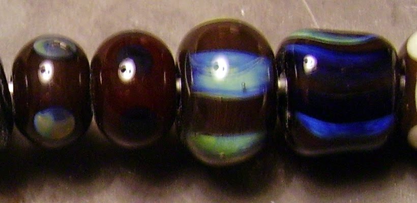 With a nod to Pat Frantz and Dragonjools in their blogs, I couldn't wait to see what it did with DH aurae. There is no visible reaction in the 2 beads on the left, which are aurae reduced and psyche, which would not reduce for me. Under encasement aurae looks very cool blue and green and triton the same, only darker. In fact, I can't really tell what the base color is in my poor lighting.
 I wanted to see what would happen over ivory and discovered two things. The first is that it doesn't react as a gold pink would by producing an ugly black spot and the second is that very cherry is a striking color. Yes, there are dots of very cherry on top of the ivory dots in the bead on the left. It doesn't do anything ugly with copper green, but I don't care for the way it looks brown over the green.
