Every once in a while I'll get a song stuck in my head. Admit it - it happens to everyone. Right now, for me, for over a week, it's been Gary Jules' version of Tears For Fears' Mad World. Folks say it's depressing but I find it hauntingly beautiful. I'm humming it and remember about a verse and keep singing it in my head. I've watched many versions on YouTube, including the original Tears For Fears version, which I don't like nearly as much and a bizarre heavy metal version that I clicked off of 1 1/2 minutes into the song. I've also watched some Weird Al but that's the subject of a different post.
It's been pretty mad here. The studio was 110 degrees for a couple days in a row and I barely torched at all, and now I'm on the weekend with Joe working and not torching as much as I'd like either.
I have made some beads. Above and below are some Breast Cancer Awareness Beads I made. I'm donating some of the proceeds to the Susan Komen Foundation for breast cancer research. I'm not crazy about the politics but I don't see the point in all the suffering cancer provides. As October draws closer I'll make many more and have some annealing as I type.
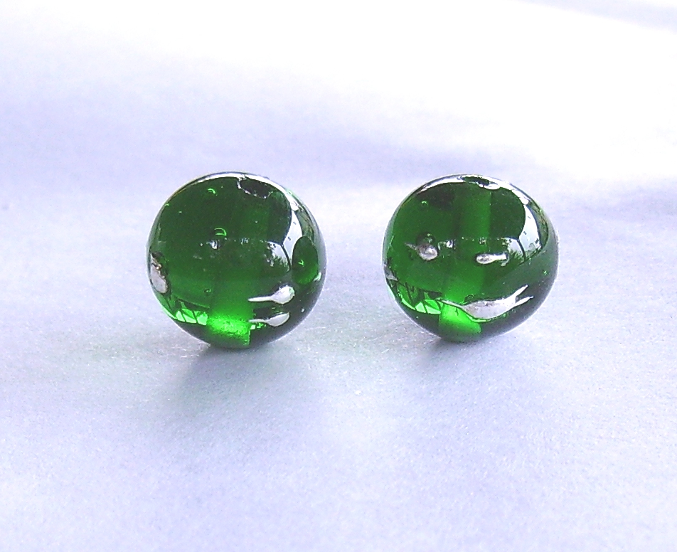
I'm tired of black and white. Here are some colors with silver wire.
The beads below I saved for last for a reason. I really love the wild way they turned out. The core, which isn't visible, is Effetre Apple Blush. I love the way silver glass pops on top of it! I made a twistie of opal yellow, Terra3 and Psyche and mixed with silvered ivory. This trio I will quite cheerfully keep for myself if it doesn't sell.
What's mad about my world? Not a whole lot, really. It's just a pretty song.
Showing posts with label yellow opal. Show all posts
Sunday, June 24, 2012
Tuesday, April 19, 2011
CiM Atlantis
I finally got a chance to replenish some of my glass, and CiM's yummy Atlantis was a new color. It's a bit of a cross between Mermaid and Ming, and a bit of an opal, though it isn't really evident if it's not layered over anything. Like all the CiM colors I've tried so far it has been easy to work, without boiling, oozing or being all shocky.
These odd beads are, from left to right, self spacer, encased with Effetre clear 006, over clear a little too thickly to see how translucent it is, with reduced silver foil badly encased in clear as my tank ran out, and the same bead badly reduced but properly encased. The glass gets a little lighter on the ends, as visible on the plain bead. I'm not sure whether working it longer or hotter makes it lighter or darker. I think the lightening is like the devitrification you see on EDP, but it isn't devitrification because it remains glossy. Cool fade effect, though. I would like to blow some shards of this to get a nice thin layer of encasement on clear to get a better translucency. I acutally like the enencased portions of the bead I reduced with silver foil better, but I'm not sure what kind of bead I'd use it in. I'll probably like this better for it's clear color.
CiM Peace separates when applied on top of Atlantis, and Atlantis spreads pretty dramatically on top of Peace. The separation of the white was still there but not as dramatic when I did this with Effetre white, probably because Peace is very slightly translucent. On the top row is a bead with a thin shard of silvered ivory melted all the way in but too small to see anything. The next is Atlantis with EDP dots. Nice edge and little reaction. The black spots on the EDP are where I overheated it and burned it. Not the glass' fault. On the right is with DH 331 test batch, a sort of Terra light, and I failed to get much color. Not a surprise considering my skill with striking DH glasses, really.
I wasn't impressed with what happened when I combined Atlantis with ivory. On the left I superheated things a bit to get the maximum reaction, and got it. The effect I got with the barely melted shard of silvered ivory was much more pleasant.
Opal yellow lightened a lot when I used it with Atlantis, and I like the absence of a reaction. If I wanted an ivory look I'd use the opal yellow. Some separation here as well, but tis cool. I'm digging the bead with CiM Tux and Atlantis. The blue is still visible but only just on top of the black, which is very neat.
This one didn't reduce well, or reproduce either for that matter, but it's with DH Triton, on the left unencased and encased on the right. The reduction effect is actually visible on the bead, but I would have liked more drama. It is my fault, not the glass.
This one surprised me. Who knew copper green would do this? It's like the copper green was trying to sink into the Atlantis but getting stuck on the edges. And the dark rim in the middle of the copper green waves and dots is just weird. I wonder if it's some sort of reduction on the copper green and if soaking the bead in lime scale remover would help? It's as if there's another color running down the middle of each copper green spot. Not when the Atlantis is on top, though. That just spreads out all over the place. I wish I'd studied more in chemistry. This is so neat and I have no idea why it does what it does.
I love this color. It's so pretty on its own I may not combine it with anything else but I'm glad I paired it with stuff ahead of time so I don't use up a whole lot on something that's not going to work the way I think it should. Maybe I should get a little more now. I tried to order some CiM Appletini and it was already sold out, and this is sure to go that way soon if they don't make more. I hope they make more of both.
These odd beads are, from left to right, self spacer, encased with Effetre clear 006, over clear a little too thickly to see how translucent it is, with reduced silver foil badly encased in clear as my tank ran out, and the same bead badly reduced but properly encased. The glass gets a little lighter on the ends, as visible on the plain bead. I'm not sure whether working it longer or hotter makes it lighter or darker. I think the lightening is like the devitrification you see on EDP, but it isn't devitrification because it remains glossy. Cool fade effect, though. I would like to blow some shards of this to get a nice thin layer of encasement on clear to get a better translucency. I acutally like the enencased portions of the bead I reduced with silver foil better, but I'm not sure what kind of bead I'd use it in. I'll probably like this better for it's clear color.
CiM Peace separates when applied on top of Atlantis, and Atlantis spreads pretty dramatically on top of Peace. The separation of the white was still there but not as dramatic when I did this with Effetre white, probably because Peace is very slightly translucent. On the top row is a bead with a thin shard of silvered ivory melted all the way in but too small to see anything. The next is Atlantis with EDP dots. Nice edge and little reaction. The black spots on the EDP are where I overheated it and burned it. Not the glass' fault. On the right is with DH 331 test batch, a sort of Terra light, and I failed to get much color. Not a surprise considering my skill with striking DH glasses, really.
I wasn't impressed with what happened when I combined Atlantis with ivory. On the left I superheated things a bit to get the maximum reaction, and got it. The effect I got with the barely melted shard of silvered ivory was much more pleasant.
Opal yellow lightened a lot when I used it with Atlantis, and I like the absence of a reaction. If I wanted an ivory look I'd use the opal yellow. Some separation here as well, but tis cool. I'm digging the bead with CiM Tux and Atlantis. The blue is still visible but only just on top of the black, which is very neat.
This one didn't reduce well, or reproduce either for that matter, but it's with DH Triton, on the left unencased and encased on the right. The reduction effect is actually visible on the bead, but I would have liked more drama. It is my fault, not the glass.
This one surprised me. Who knew copper green would do this? It's like the copper green was trying to sink into the Atlantis but getting stuck on the edges. And the dark rim in the middle of the copper green waves and dots is just weird. I wonder if it's some sort of reduction on the copper green and if soaking the bead in lime scale remover would help? It's as if there's another color running down the middle of each copper green spot. Not when the Atlantis is on top, though. That just spreads out all over the place. I wish I'd studied more in chemistry. This is so neat and I have no idea why it does what it does.
I love this color. It's so pretty on its own I may not combine it with anything else but I'm glad I paired it with stuff ahead of time so I don't use up a whole lot on something that's not going to work the way I think it should. Maybe I should get a little more now. I tried to order some CiM Appletini and it was already sold out, and this is sure to go that way soon if they don't make more. I hope they make more of both.
Labels:
beads,
CiM Atlantis,
CiM tuxedo,
color testing,
copper green,
triton,
yellow opal
Sunday, August 8, 2010
My Favorite Oops
This is my favorite bead yet that didn't come out the way it was supposed to. I got the shape wrong, so I can't sell it. The ends are a bit off and the taper on the long bicone is irregular. What a shame. I'm just going to hate making this into a nice piece of jewelry for myself.
The body of the bead is apple blush, covered with a twistie made from opal yellow, psyche and Terra2, CiM adamantium ends and silvered ivory and psyche stringer decoration. The Terra2 didn't strike very well but I got a really cool mother of pearl effect and the opal yellow struck to a pinkish blush, which goes swimmingly with the small bits of apple blush visible under the stringer. The psyche reduced better in some places than others, but I was at the end of the cylinder.
I can't quite put my finger on what this bead reminds me of. Something Japanese and/or Mucha. I have a set of Mucha prints that depicts the four hours of the day, morning, midday, evening and night that this reminds me very strongly of, but others have said that it reminds them of Japanese art or desert branches.
With any luck the couple beads I made to match will turn out ok and I can make this into a bracelet or necklace.
The body of the bead is apple blush, covered with a twistie made from opal yellow, psyche and Terra2, CiM adamantium ends and silvered ivory and psyche stringer decoration. The Terra2 didn't strike very well but I got a really cool mother of pearl effect and the opal yellow struck to a pinkish blush, which goes swimmingly with the small bits of apple blush visible under the stringer. The psyche reduced better in some places than others, but I was at the end of the cylinder.
I can't quite put my finger on what this bead reminds me of. Something Japanese and/or Mucha. I have a set of Mucha prints that depicts the four hours of the day, morning, midday, evening and night that this reminds me very strongly of, but others have said that it reminds them of Japanese art or desert branches.
With any luck the couple beads I made to match will turn out ok and I can make this into a bracelet or necklace.
Labels:
apple blush,
CiM adamantium,
psyche,
TE-362,
yellow opal
Saturday, August 7, 2010
Off Mandrel Pendant
Sometimes you get eggs, sometimes you get nothing but a bunch of shells and a mess. The leaf bead I posted last is no more. I had it strung on some wire for a pendant and dropped it. The leaf stayed intact but the loop broke off. Nuts. I made another one and strung it with the Effetre light pumpkin one and one I made with opal yellow, and have a nice pendant I am slowly turning into a necklace.
Opal yellow is a tricky color to work with for an off mandrel leaf. It is very soft and wants to flop around all over the place. I committed the extra sin of wanting a notched, oak leaf appearance and chopping at it with my glass shears. This was done with the glass very nearly cool, then I reheated the piece to fire polish it. The resulting leaf was a bit strangely shaped, but, hey, it looks like a leaf. The spots are Terra2, which apparently likes to reduce as well. I didn't mean to, but it isn't ugly so I'll take it. I also got some reducing frit in with the bordello, as evident on the orange leaf.
The way I'm making the leaves is to make a gather on the end of the rod, rolling it in frit or decorating it with stringer, pressing it in the leaf masher, heating the end and attaching an only slightly heated steel chopstick and cutting off the rod and forming the loop. Then I hold the loop in a pair of pliers while I remove the punty and polish the end. I'm sure infinite shapes are possible this way, but right now I'm stuck on leaves. If anyone knows a better way please let me know.
As far as my color diet, I'm retiring olive for the time being. It is a great shade of green and truly appropriate for fall but I'm playing with apple blush until I can figure out how to get a predictable orange blush or get sick of it and give up. I am also going to play with some CiM pheonix shortly, probably in place of the Effetre light pumpkin.
Opal yellow is a tricky color to work with for an off mandrel leaf. It is very soft and wants to flop around all over the place. I committed the extra sin of wanting a notched, oak leaf appearance and chopping at it with my glass shears. This was done with the glass very nearly cool, then I reheated the piece to fire polish it. The resulting leaf was a bit strangely shaped, but, hey, it looks like a leaf. The spots are Terra2, which apparently likes to reduce as well. I didn't mean to, but it isn't ugly so I'll take it. I also got some reducing frit in with the bordello, as evident on the orange leaf.
The way I'm making the leaves is to make a gather on the end of the rod, rolling it in frit or decorating it with stringer, pressing it in the leaf masher, heating the end and attaching an only slightly heated steel chopstick and cutting off the rod and forming the loop. Then I hold the loop in a pair of pliers while I remove the punty and polish the end. I'm sure infinite shapes are possible this way, but right now I'm stuck on leaves. If anyone knows a better way please let me know.
As far as my color diet, I'm retiring olive for the time being. It is a great shade of green and truly appropriate for fall but I'm playing with apple blush until I can figure out how to get a predictable orange blush or get sick of it and give up. I am also going to play with some CiM pheonix shortly, probably in place of the Effetre light pumpkin.
Labels:
apple blush,
beads,
CiM bordello,
light pumpkin,
yellow opal
Wednesday, May 26, 2010
Psychedelic Ribbons
Friday, March 12, 2010
longer beads
I've been working on some longer beads to go in the party tools I picked up. It's quite a challenge keeping these things hot. I am positively terrified of going to rewarm them and blowing them up. Don't laugh. This has happened. I keep the exploded bead on my workbench as a reminder, as well as the chunk that landed on the seat cushion while I happened to be working from the seat. This is the longest one I've made to date, and I didn't measure it because I couldn't find any measuring device. They are all hiding and will in due course be found. I had to pick a striking color because I like a challenge, in this case CiM stoneground. The decoration is sis.
This one is very pretty, but for this design I need more width. I think I will wait until I have the masher to do something flatter. The base is cobalt and the decoration is spirals of DH triton and aurae, feathered, reduced, and encased haphazardly in clear. It is a pretty bead, but not one that works in this design.
My favorite of the lot, and one that, unfortunately, came up too short. The base is Vetrofond extra light olive and the decoration is a twistie made from opal yellow and psyche. I love the way the reduction on the psyche is so variable. It really is a kind of rainbow effect. This was a tough bead to make because the E.L.O. is really soft when hot and started to droop badly when I was applying the stringer. As a result the center is not wonky, thanks to the marvering, but not as developed in color as I might have hoped for. What do I want? I very nearly had glass dripping on the table. Some of the stringer is buried deep within this bead.
This one is very pretty, but for this design I need more width. I think I will wait until I have the masher to do something flatter. The base is cobalt and the decoration is spirals of DH triton and aurae, feathered, reduced, and encased haphazardly in clear. It is a pretty bead, but not one that works in this design.
In addition to continuing to work on my size perception (is there a way to mark the mandrel?) I have to work on getting the ends to look pretty. Hmmm.
Labels:
aurae,
beads,
CiM stoneground,
cobalt,
ELO,
ivory,
psyche,
triton,
yellow opal
Sunday, February 28, 2010
Double Helix psyche
Double Helix has a truly amazing line of glass, which I have only begun to dip my fingers into. It changes color, goes all metallic, shifts color depending on the light source and generally is impossible to exhaust the possibilities of. It is also a bit tricky to work on a HotHead torch. Naturally, I have bought all the colors I can afford. I won't use this all up since as my technique and studio improves I will continue to make discoveries. Like this one. Thanks to Pat Frantz and her blog, I know that psyche likes ivories. So I rounded up most of the obvious ones I have and tried it out. So what did I find out? It is indeed possible to really strike this color, you just have to really turn up the gas. I've been making the beads in a moderate flame, then finishing them off low in the flame. This isn't enough. I have to make the bead, heat it to soup, then let it cool to no longer any hint of glow and turn the flame way up and reduce it low in the flame. Then I get iridescence, in fact I get color change!
1 psyche stringer on opal yellow, then 2 is opal yellow on psyche. I like the rim on the edge of the opal yellow but I didn't get any webbing. I wonder if this might have struck to pinkish a little in the reducing flame.
3 isVetrofond river rock, then 4 psyche with some very thin river rock webbing. I like the webbing on the river rock, but the psyche doesn't strike very well right next to the ivory.
5 is Vetrofond dark ivory and psyche stringer, then 6 is the same reversed. The color change on bead 5 is not as visible on this photo as I would like, and I was too low on gas to strike the psyche properly on 6 but this is not as obvious an effect as on the other beads.
7 is psyche with silvered ivory stringer. Because of the thinness of the stringer and the lack of striking next to it, the psyche only reduced on the ends, but this bead bears further investigation. I have to learn to make thicker stringer. I either melt it all over the place and it's crooked or I pull it too fast and thin.
8 is Effetre sediment with psyche stringer and 9 is the reverse. I got some really cool greens and blues out of the psyche on 8 and was running out of gas and didn't properly strike 9.
10 is psyche stringer on Vetrofond E. L. O. This didn't do as much cool stuff as I could have hoped, but I wasn't making a very large bead and didn't get as many cool effects as I could have with a larger mass of glass.
11 is CiM khaki with a twistie made of psyche and opal yellow. You can't really see the khaki under all the twistie I piled on but there is quite a bit of separation of the khaki near the ends. Next time I'll leave more khaki showing.
All of them reduced far better than any previous efforts. My favorites are the ones where the psyche went greenish. Green and purple is a great combination. I didn't get a whole lot of the webbing, but on the river rock and E. L. O., I got a tiny bit on the edges of the stringer. I think I needed to superheat it more, but to be frank, I'm worried about dripping glass all over the place so when it gets really liquid I remove it from the heat. I wonder if prolonged heating at a slightly lower heat would do this?
To the left is a picture of my first attempt to do something with psyche, not very convincing. The left bead is encased over clear and reduced a little and on the right is encased, which does nothing for it. Check out the triton next to it, now that's dramatic. I like psyche as decoration better. I flatter myself to think I understand it a little better now.
1 psyche stringer on opal yellow, then 2 is opal yellow on psyche. I like the rim on the edge of the opal yellow but I didn't get any webbing. I wonder if this might have struck to pinkish a little in the reducing flame.
3 isVetrofond river rock, then 4 psyche with some very thin river rock webbing. I like the webbing on the river rock, but the psyche doesn't strike very well right next to the ivory.
5 is Vetrofond dark ivory and psyche stringer, then 6 is the same reversed. The color change on bead 5 is not as visible on this photo as I would like, and I was too low on gas to strike the psyche properly on 6 but this is not as obvious an effect as on the other beads.
7 is psyche with silvered ivory stringer. Because of the thinness of the stringer and the lack of striking next to it, the psyche only reduced on the ends, but this bead bears further investigation. I have to learn to make thicker stringer. I either melt it all over the place and it's crooked or I pull it too fast and thin.
8 is Effetre sediment with psyche stringer and 9 is the reverse. I got some really cool greens and blues out of the psyche on 8 and was running out of gas and didn't properly strike 9.
10 is psyche stringer on Vetrofond E. L. O. This didn't do as much cool stuff as I could have hoped, but I wasn't making a very large bead and didn't get as many cool effects as I could have with a larger mass of glass.
11 is CiM khaki with a twistie made of psyche and opal yellow. You can't really see the khaki under all the twistie I piled on but there is quite a bit of separation of the khaki near the ends. Next time I'll leave more khaki showing.
All of them reduced far better than any previous efforts. My favorites are the ones where the psyche went greenish. Green and purple is a great combination. I didn't get a whole lot of the webbing, but on the river rock and E. L. O., I got a tiny bit on the edges of the stringer. I think I needed to superheat it more, but to be frank, I'm worried about dripping glass all over the place so when it gets really liquid I remove it from the heat. I wonder if prolonged heating at a slightly lower heat would do this?
To the left is a picture of my first attempt to do something with psyche, not very convincing. The left bead is encased over clear and reduced a little and on the right is encased, which does nothing for it. Check out the triton next to it, now that's dramatic. I like psyche as decoration better. I flatter myself to think I understand it a little better now.
Labels:
beads,
color testing,
ELO,
ivory,
psyche,
river rock,
sediment,
yellow opal
Saturday, February 20, 2010
effetre metallic black
This is one that everyone but me knows how it looks and what it does, and has switched to dark silver plum or gunmetal to save on cost, but I had to do it. It is similar to dark silver plum in the lustre that it creates and the method I have to do it on my HotHead, but the tonality involved is very different in a subtle sort of way. Does that sentence make sense?
1 is by itself heated very gently for quite a while to really make it pearlize as much as it was going to.
2 is the same bead with dark silver plum scrolls. The plum predominates on the visual impact and this is the real difference.
3 is encased, and the pearly effect was lost, with no surprises all around.
4 is with copper green red and this is a beautiful bead. The color is like a moon on the water or something equally poetic. Just plain pretty.
5 is on top of Effetre intense blue. I still have some kinks to work out on my lentil press. Pressing the bead does accentuate the pearly process, which is what I was trying to find out.
6 is with triton and 7 is with aurae. They are supposed to be brother and sister and they seem to be on these beads. On 6 you have steel and on 7 you have purpley gold. On both beads, the pearl effect is extinguished where it comes in direct contact with the silver glass.
8 is with opal yellow stringer because the plain ivory was buried under a pile of other stringer. This says a lot about my worktable and something about the colors. The two aren't all that much alike, are they? Interesting zoo effect, though.
9 is with sis and all I can say about this bead is that it is prettier in real life. What was I thinking?
10 is on Effetre sedona as stringer. Getting the metallic black to do its thing while not devitrifying the sedona was no mean feat, and I like this color combination. A sucessful bead, all in all.
11 was with EDP stringer, and all I can say in my defense is that the EDP struck nicely. Getting the metallic black to go all pearly and not devitrifying the EDP is something I dare anyone to try.
Will I buy this glass again? Yes, when my current stock runs out. How much will I use? I don't know.
1 is by itself heated very gently for quite a while to really make it pearlize as much as it was going to.
2 is the same bead with dark silver plum scrolls. The plum predominates on the visual impact and this is the real difference.
3 is encased, and the pearly effect was lost, with no surprises all around.
4 is with copper green red and this is a beautiful bead. The color is like a moon on the water or something equally poetic. Just plain pretty.
5 is on top of Effetre intense blue. I still have some kinks to work out on my lentil press. Pressing the bead does accentuate the pearly process, which is what I was trying to find out.
6 is with triton and 7 is with aurae. They are supposed to be brother and sister and they seem to be on these beads. On 6 you have steel and on 7 you have purpley gold. On both beads, the pearl effect is extinguished where it comes in direct contact with the silver glass.
8 is with opal yellow stringer because the plain ivory was buried under a pile of other stringer. This says a lot about my worktable and something about the colors. The two aren't all that much alike, are they? Interesting zoo effect, though.
9 is with sis and all I can say about this bead is that it is prettier in real life. What was I thinking?
10 is on Effetre sedona as stringer. Getting the metallic black to do its thing while not devitrifying the sedona was no mean feat, and I like this color combination. A sucessful bead, all in all.
11 was with EDP stringer, and all I can say in my defense is that the EDP struck nicely. Getting the metallic black to go all pearly and not devitrifying the EDP is something I dare anyone to try.
Will I buy this glass again? Yes, when my current stock runs out. How much will I use? I don't know.
Labels:
aurae,
beads,
black metallic,
CiM gunmetal,
color testing,
copper green red,
EDP,
plum silver,
sedona,
triton,
yellow opal
Tuesday, February 16, 2010
Effetre yellow opal
Today is Mardi Gras, which we all know means beads! So, I am allowing myself 2 posts. This color has been haunting me since I want to explore its unique place in the color spectrum. The rods are an unassuming beigey yellow, and the beads work up to, surprisingly enough, about the same color. But what a color. I've been working with all kinds of colors, be they beige, pink, yellow, purple, green, or whatever. This one thrills me. Not because it does anything spectacular, but because it is. I got CiM stoneground because it was supposed to be close to it, but it really isn't. I may wind up using stoneground more, because it does neat things with silver that yellow opal doesn't. What this color does is fill a unique place in my spectrum. Frankly, the price will keep me down to using a moderate amount of it, but this is the yellow I've been searching for. OK,enouth raving, here are the beads.
1 is plain and unencased.
2 is encased with effetre clear. There is a pink tinge to the encased beads which I think is a characteristic of effetre super clear. I'll roll with it for now.
3 is with silver foil, melted down and encased in effetre clear.
4 is with silver foil, melted in. I was surprised that it didn't maintain more of a silver character.
5 is with DH aurae, melted in somewhat and reduced. This is gold.
6 is with aurae, melted in, reduced, and encased with super clear. Not quite the purplish reaction I was expecting.
7 is with SIS.
8 is with ivory.
9 is with CiM hades. The black doesn't spread as much as I thought it would. Is OY a spreader?
10 is with effetre dark turquoise 236. Yep, it is.
11 is with copper green red. I like that the copper green red remained in its red phase for this one. I don't know how I would have dealt with green, which is why I din't go with the plain version of copper green. There is a faint grey line on the turquoise, so I think it would have done a pale imitation of this, snce it tried to on the copper green red, but I don't know. I don't know if I'll find out, since I like this combination.
Finally, 12 is with plum silver dark. Just because. The plum silver was tough to set, but this was not unexpected because my torch seems to be running hot and the "easy" colors are getting tougher.
Will I buy this color agan? Yes, because I like it.
1 is plain and unencased.
2 is encased with effetre clear. There is a pink tinge to the encased beads which I think is a characteristic of effetre super clear. I'll roll with it for now.
3 is with silver foil, melted down and encased in effetre clear.
4 is with silver foil, melted in. I was surprised that it didn't maintain more of a silver character.
5 is with DH aurae, melted in somewhat and reduced. This is gold.
6 is with aurae, melted in, reduced, and encased with super clear. Not quite the purplish reaction I was expecting.
7 is with SIS.
8 is with ivory.
9 is with CiM hades. The black doesn't spread as much as I thought it would. Is OY a spreader?
10 is with effetre dark turquoise 236. Yep, it is.
11 is with copper green red. I like that the copper green red remained in its red phase for this one. I don't know how I would have dealt with green, which is why I din't go with the plain version of copper green. There is a faint grey line on the turquoise, so I think it would have done a pale imitation of this, snce it tried to on the copper green red, but I don't know. I don't know if I'll find out, since I like this combination.
Finally, 12 is with plum silver dark. Just because. The plum silver was tough to set, but this was not unexpected because my torch seems to be running hot and the "easy" colors are getting tougher.
Will I buy this color agan? Yes, because I like it.
Labels:
aurae,
beads,
CiM hades,
CiM stoneground,
color testing,
copper green red,
ivory,
plum silver,
yellow opal
Subscribe to:
Posts (Atom)