Pages


Showing posts with label aurae. Show all posts

Wednesday, July 21, 2010

Fall (color) Diet Pictures

 I haven't posted many pictures since the weekend, but I have been working.  I really like the way the glass is acting on the new diet.  I confess to a certain amount of premeditation with the way these turned out in that I knew that many of the colors I picked were going to do neat things when I combined them with metals and silver glass. 

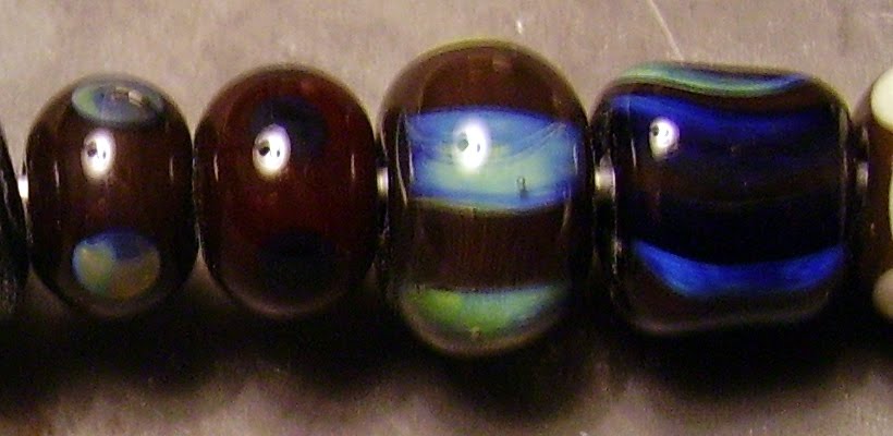
The bead on the left is made on CiM lapis with a twistie of copper green, CiM bordello, DH Aurae, and DH terra2, with some silvered ivory thrown in for good measure.  Believe it or not, the weird greenish stripe bordered with black is the bordello.  This, I was not expecting.  I can only speculate that the greenish color is it reacting to the silver glasses next to it and the black stripes are it reacting to the copper green with the silvered glasses.  If anyone else has any suggestions of what it could be, please leave a comment because I like it but I'm stumped.
 The long bead on the right is a base of Effetre dark red special, 1/2 rolled in silver foil and melted, rolled in a DH reducing frit blend on the other half, wrapped with the same twistie as above and silvered ivory stringer, and swirled in a couple places.
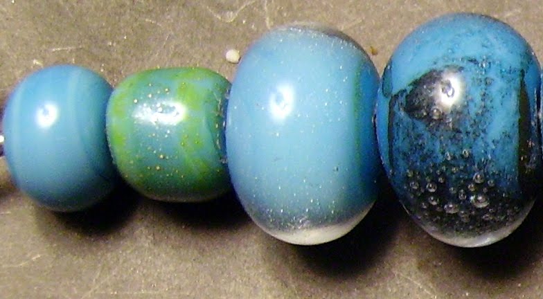
 This is where the battery on my camera died, so I had to settle for a group picture of the remaining beads.  You'll see more of the copper green stringer, plus one made with just DH terra2 and aurae, and another made with EFF dark red, light pumpkin and trans topaz on a base of clear.  I used silver foil, DH reducing frit, and silvered ivory stringer pretty liberally on all of these.  The only one that has anything different is the center bicone, which has another stringer made with a very tight twistie of CiM adamantium and silvered ivory.
I hope you've enjoyed this sneak preview into the beads I will be listing over the next week or two.

I'm going back to work tomorrow so I don't know when I'll be torching next, but when I have new beads I will post them.

Friday, June 18, 2010

Finally

I was so thrilled with how these turned out I couldn't wait to post them. I couldn't even wait to clean them, so please forgive the mandrels and bead release. They are both heavily encased and decorated in or on the encasement, and they are both on the diet! I can stick to the diet and still produce beads that I can use for a project, as long as it's the right project.


On the left is a base of CiM tuxedo, encased with CiM clear, decorated with a twistie of copper green and CiM Slytherin and a flower or two of CiM poi stringer encased with ink blue. On the right is a base of CiM poi, encased with CiM clear and decorated with dots of the copper green and slytherin stringer. I really dig the way the poi shifts by encasement with the ink blue, and also the way the copper green and Slytherin react with each other. I think the combination works with the plaques better than either color alone would have. Who knew?

For a double shot of my beads on the Creation is Messy site, and to find out more about poi, click here for CiM.


I couldn't just make 2 beads, so I dipped the clear in the DH reducing frit blend I had made and made a fritty bead with this. The glasses were Aion2, CE 352 (when it comes into production it will be Calliope), Aurae, Triton, and Psyche. The Psyche didn't reduce, but everything else did and looks fascinating under the clear. Now I'll have to make more of these, which will mean making more frit, so I can do something with them.


Confession time. This is off the diet, but I couldn't resist using some CiM Sherwood to make the beads on the right. On the left is plain, middle with a wrap of a Triton shard, and on the right is encased with CiM clear and dotted with poi. I love the way the Sherwood is still a bit streaky under encasement.


Ever notice the way your state of mind affects everything you do? Yesterday was a good day and everything went right. The beads turned out the way I pictured they would (when does that happen) I finished in time, and the weather even cooperated today with just the right amount of sun so I could take some decent pictures. I'm going to quit while I am ahead. I have a doctor's appointment today and am hoping to get back to the day job so I can buy more glass again.


One more thing from yesterday: I found a studio near me, about an hour away in Booneville. I didn't get a chance to look into much about it and, frankly, don't have the money until I go back to work to do anything about it, but at the same time, the prospect of taking my first class or two and using a proper torch is scary and intoxicating. Here's the link to their website, and they also have a Facebook page which is how I found them.CNY Glass Studio

Friday, April 30, 2010

CiM sangre

CiM sangre is a glass that has given me fits since I bought 2 rods of it soon after I started lampworking. I complained that Effetre 076 transparent red was difficult to strike and Molly Heynis at Heritage Glass recommended sangre as an alternative. In addition, it was supposed to be resistant to burning and going orange and doing all the ugly things other transparent reds tend to do. I still find it fairly tricky to strike and it has gone orange on me on more than one occasion. My photography setup, if one can call it that, has a lot to do with my dissatisfaction with the color in general, since it requires outdoor sun to do it justice and I simply don't have that in abundance. These were taken in the middle of the parking lot of my apartment building.


On the right are a handful of beads that I made with the color to put it through its paces. On the wire are plain, sangre encasing clear, sangre encased with clear, silver foil just melted in, which isn't pretty, silver foil reduced and encased with clear, which, frankly, I was expecting more out of, and my sangre/aurae test bead. Below it in the same picture are the "real" bead, made with a base of sangre, dots of aurae covered with clear, and a triton shard thrown in for good measure, and two beads I experimented with by wrapping a clear core with sangre and aurae twistie, encasing it in more clear and mashing them.
Here are two more views of my more serious bead, not helped at all by my camera, I'm afraid. Again, these are dots of aurae topped by bumps of clear, running together in the second side, and a wrap of a triton shard. I almost think I like the effect of the second side better, even though it wasn't what I was intending.


Now all I have to do is find a camera that is capable of making the beads look like they do in real life.


So how does sangre do with being a transparent red that strikes easily, doesn't burn out, and doesn't go orange? It doesn't burn out and it resists going orange. It strikes more easily than Effetre or Vetrofonds efforts in that regard. Transparency? Depends on the size of the bead and how it is worked. If the bead is anything above spacer sized and is going to be actually worked as opposed to wound off and cooled, don't count on it.


I plan on buying more CiM sangre when I run out, since by far, it is the easiest transparent red that I have found to work with.

Wednesday, April 28, 2010

Effetre nile green opalino

Effetre nile green opalino wasn't available for a while, and having worked the others, I was anxious to give this a whirl. It is a nice, spring green that I think works best by itself. It remains stiff when worked, more toward the transparents than the opaques. I found myself constantly resisting the urge to work lower in the flame or turn up the gas, since this color is ridiculously sensitive to torch chemistry and if the flame is too reducing, the beads will go an ugly, greyish olive with "smoke" spots on them. If they had beed surface flaws, I might have tried etching to remove the discoloration, but the glass was stained all the way through so I threw out a couple beads where I wasn't able to resist temptation.

Plain, these are a nice, jade green that becomes more ethereal when encased in clear. Note the lack of a clear dividing line where one glass starts and the other stops. Following Pat Frantz's advice, all the encased beads were made on a core of clear to prevent cracking, which the opalino colors are supposed to be prone to do when encased.


Application of metal is a way to shift the hue of this green toward yellow or blue. Adding either does affect the surface, which must be taken into account, but the silver definitely shifts the glass strongly toward the yellow end and copper sends it equally decisively toward the blue. Both have tiny bubbles on them, with the copper being more noticeable.


Double Helix aurae doesn't do well on this glass and I doubt I will do this again. It is interesting the way the unencased bead has separation of the aurae.


I wanted to compare the effects of ivory and CiM butter pecan on a real bead and found they were similar. Both separated a bit, with the ivory on the left separating more strongly, and both are about the same shade. I thought the green glass would react with the ivory to produce a grey line, which it didn't, so I will have to compare them again on a color which I know does.


CiM tuxedo reflects quite a bit into the opalio, and the opalino dots on top of it are invisible. I ran out of gas just as I made the middle bead with intense black, but I believe the tiny opalino dots on top of the intense black ones would have been a waste of time. I was pleased that Gelly's sty didn't do anything weird with the opalino, since I may do something in a muted floral with these two.


I would probably buy this glass again. It is a color that does not really appear in the other manufacturer's lines and will make nice beads as long as I don't forget what it can and can't do.


Tuesday, April 27, 2010

CiM plum

Creation is Messy has one thing right: It's customers like purple. I do. Plum was released quite a while ago but only recently found its way into my stash. For a link to CiM's website and to see what others have done with this amazing color, click here http://www.facebook.com/?sk=messages#!/profile.php?id=100000449052869 It is billed as an opal and acts like one, melting easily but remaining midway between an opaque and a transparent in stiffnes when hot. This makes it very easy to work with, neither dripping all over the worktop or being so stiff that it pulls other colors off when applying decoration.

Plain, it is a nice, translucent orchid purple. Encased in clear, it lightens a little but seems to become even more translucent. The edge between where the encasing stops and the core starts is slightly blurred. With plum encased over a clear core, the translucency is magnified but the color remains darker.


Silver foil just disappears when just melted into this, but when it is reduced and encased in clear it gives that pearly lavender lustre that I like. Copper leaf looks better than I have come to expect and is a combination that I will probably use again. I only tested DH aurae with plum but was very happy with the bead I made, a base bead of plum with dots of aurae encased with bumps of clear.


CiM tuxedo looks good on plum, remaining crisper than I expected. The dots of plum on top of the tuxedo half of this bead did disappear. Psyche didn't reduce well on the next bead, but I am beginning to think I pulled a stringer of dark amethyst or Effetre black (which I didn't think I had) because none of the beads I have made with this stringer have reduced. Plum silver looks better on the middle bead than the picture shows. The metallic effect stays near the edges and the center has a bit of a line down it on the plum silver scrolls, but I would not be afraid to do this again. Copper green looks nice against the soft plum, but unless something very subtle is desired, there's no point in putting the plum on top of the copper green. EDP looks a bit weird, making the plum underneath look redder than it would be. I wonder what Effetre Sedona would look like with the plum? It seems they are almost the same shade.


Definitely worth a second purchase.


Sunday, April 25, 2010

CiM smurfy

Creation is Messy smurfy is amazingly well behaved. Up until now I've only used Effetre 236 dark turquoise and never saw any reason to do otherwise. Now I doubt I will use it again. Smurfy is not an exact match for the color; the Effetre 236 is a tad darker. Smurfy is a bit streakier, especially if the bead is simply wound and finished, as I usually do. There is no boiling and this glass is so much easier to work. I did have an issue with the flame on my HotHead reducing the first bead I made, but this was due to a problem with how the torch was attached to the new tank. I was very glad I was using a turquoise, since the minute it went brick red I knew I had a problem and was able to correct the reduction issue and go back to torching.

Plain, smurfy is a nice, medium turquoise with some streaks, which aren't a problem for me, and absolutely no pitting. With silver on its own there is some yellow fuming, which may work in a specific application that I can't imagine at the moment. The same bead reduced was neat to look at, but the minute I encased it, there was nothing to indicate that silver was ever there. With copper, there is a neat blue-black film and some less-neat bubbles under encasement. Without encasement the copper leaf looks like burned rice paper.


Considering what happened to the silver, I didn't think I'd like the Double Helix aurae, but I'm glad I tried it. Under encasement, there is an attractive, subtle rainbow that goes well with the turquoise. Without encasement, the gold makes a nice contrast.


None of the color reactions surprised me. From left to right are light (?) yellow pastel, ivory, EDP, red roof tile (which didn't do the dark orange to yellow fade I was hoping for), intense black, and plum silver.


I will be buying this glass when my current supply runs out, because even if it costs a few pennies more, it is so much easier to use I will save it in aggravation.


Friday, April 23, 2010

Effetre light violet transparent

Lately, I've been going through my stash of beads and photos and publishing some of the ones that got away. This is such a one, although I don't know why it did, because it's purple! The color is Effetre light violet transparent, which is a premium color, but I don't know why because it is machine pulled. Regardless, it is a nice shade that is sufficiently different from their amethyst color to merit a separate purchase. It melts very slowly, resists thermal shock and remains very stiff when working.
Plain, it appears very dark indeed, which makes me wonder if there was ever a medium or dark violet and what color it looked. With silver foil melted in and left alone, only tiny beads of silver on the surface indicate that anything was done to the bead. It is when the silver is reduced and encased in clear that something magical happens. I really love this effect.

With silver-rich Double Helix aurae, the plain bead looks ok but nothing to write home about. Encase it with clear (I wonder what would happen if I used another color?) and it shows off beautiful blues and greens.


I wanted to see what would happen to the intensity of this color when layered with other colors, and here's my answer. The violet recedes a little and lives up to its name. It is a lovely shade and I must say I am rather pleased the way this floral turned out. The base glass is Vetro lemongrass odd, which I love as a background for purple flowers. On ivory, nothing ugly happens, but I think that the ivory separated and darkened a bit more than I can usually get it to. Over white the violet remains rather dark, but the layer was a bit thick.


EDP scrolls bleed a lot over the violet, but that is to be expected considering the extreme difference in viscosity between the glasses. I don't know what I was trying to do by putting dots of light violet over a clear base bead, but what I did was make a bead that looks very much like it was made of only a very pale violet glass. The violet dots on top of the copper green are disappearing, but the copper didn't do anything ugly.


Would I buy this again? Oh, yes. It's purple.

Wednesday, April 21, 2010

CiM Gelly's sty

Another CiM color that almost slipped by me. They have so many, I'd go broke trying to own them all, but I'd love to try. This one is really a unique shade of pink. It is slightly translucent, but this is part of its charm. Effetre rose opalino is similar, but it is a pain to work with and Gelly's sty doesn't need to be struck. I think the best thing about it is that it plays so well with other colors. The material from Creation is Messy says that it goes light under encasement and likes to be worked hot. There are reports that it can be shocky (oh, no) and devitrifies. I was forewarned on the shockiness and as far as the devitrification goes, I'll just have to see.


Plain reveals a pretty, rose petal shade of pink. Encased, it looks pretty much the same to me. Perhaps a tiny bit more translucent. Maybe a good thing. If I want an ethereal pink, this is the color for me.


I didn't even bother testing this one with silver or copper, since I knew it would go all yellow with silver and I have yellow opalino and CiM ghee for that. With copper I just wasn't interested. I suspect the shockiness advised against comes after cooling without kilning so we'll just see how the plain encased bead does before I add copper to the mix. With DH aurae, pictured here, it goes golden and highlights the gold dots of the aurae. Nice. I love what it did under encasement. I only wish my clear didn't scum up.


The translucent quality of Gelly's sty is really highlighted by its use with CiM tuxedo. The tux seems to be slightly absorbed by the pink, but that is light transmission, because the edges of the black on pink are nice and crisp. The pink on black looks slightly lavender. I have to try encasing a tux bead with Gelly's sty now. EDP bled a little but works well on this pink. No burning! I really like that there is no reaction with ivory. I was sure there would be. The dots of pink on top disappear on both the ivory and the white next to it. Gelly's sty is fairly stiff for an opaque, so that explains the ivory and white bleeding.


Yellow seems to bleed a little but there is no ugly reaction. Strangely, copper green appears bleached out. there is nothing ugly happening here and I would feel confident using the 2 together, but I would wish for more contrast. The intense black stays crisp and the Gelly's sty separates into that neat mouth thing, but it is almost invisible due to its lack of saturation. Trying to get plum silver to go metallic without devitrifying was a task beyond me, but there is a hint of a shimmer, trust me.

I will definitely be buying more of this color. It is a pleasure to work with and an unique addition to my palette.


Tuesday, April 20, 2010

Effetre very cherry

It seems I bought a whole lot of Effetre at once. This is a very deep red, if a cherry it's an overripe Bing. It comes out as a semitransparent, very deep red. The rods I got were about 9mm, and thus I was a little nervous about heating them, but I shouldn't have worried. While not melting as slowly as a transparent, they are certainly stiffer than the 436 dark red special, and not at all shocky. In terms of hue, I am strongly reminded of CiM bordello.


Since this is a semitransparent color, I wanted to see what it would look like self and encased. The left bead is a self spacer, the second is over clear and the 3rd over white. All look dark red and the self one is a very deep, very rich red.


With silver this color really looks cool. A hint of this can be seen on the left bead, with some bluish effects, but it really shines (literally) in the rainbow irridescence of the middle bead, which is silver foil melted in, reduced and encased in clear. Copper leaf encased in clear is not impressive.


With a nod to Pat Frantz and Dragonjools in their blogs, I couldn't wait to see what it did with DH aurae. There is no visible reaction in the 2 beads on the left, which are aurae reduced and psyche, which would not reduce for me. Under encasement aurae looks very cool blue and green and triton the same, only darker. In fact, I can't really tell what the base color is in my poor lighting.


I wanted to see what would happen over ivory and discovered two things. The first is that it doesn't react as a gold pink would by producing an ugly black spot and the second is that very cherry is a striking color. Yes, there are dots of very cherry on top of the ivory dots in the bead on the left. It doesn't do anything ugly with copper green, but I don't care for the way it looks brown over the green.


I have nothing against this color and would buy it again, but its depth of color makes it hard to find a use for. One thing to note is that it is very much easier to work than 076 striking red.

Monday, April 19, 2010

Vetrofond pearl grey

I've been on bed rest for almost a week and these posts represent me rounding up the pictures of beads that I made previously and haven't had a go at yet. This is a color that I didn't think I'd like at all in rod form but was pleasantly surprised at with the finished beads. The rods melt nicely and the color makes a pleasant background against everything except silver and Double Helix glass.


The first bead is plain for comparison. When I had made this, I noticed that the end of the rod nearest the melted section had gone whitish without devitrifying, so I had to try to do this on purpose. The bead on the right is this attempt. I think it looks a little lighter. This glass reminds me of CiM glacier a lot.


With silver and the DH glasses psyche and Aurea, the yellowish fuming spoils it for me. I do like it with copper leaf, encased in clear. This is the bead in the middle.


This plays well with other colors, especially the copper green, producing a nice spring palette. The bead in the middle with the intense black layered dots looks pretty neat. I'm not as fond as the same effect with EDP.

I don't know if I would buy this color again or CiM glacier. For my purposes the two are nearly interchangeable.


Saturday, April 17, 2010

Effetre chocolatta


OK, when I blogged CiM adamantium, I said it was a milk chocolate color.  I didn't know what I was talking about.  This is the chocolate brown.  I could put these in a bowl with candy and be doing the Heimlich maneuver in no time.  The glass melts like chocolate, too.  Perhaps that is why I forgot I had made a bunch of beads and made them again.  I was having too much fun.

With metal it's not impressing me, but who cares.  For the purpose of thoroughness, left to right are plain, with silver foil, same encased, and copper leaf.


With DH aurae and triton, I'm not too happy, but psyche looks promising in a raspberry truffle kind of way.


Plum silver looks kinda nice, like spots of dark chocolate, but copper green is unfortunate, since I could have gone for the whole chocolate and mint thing.  EDP separates the chocolatta, which is a shame. 


Ivory separates the chocolatta, as well, but I'm getting used to it bleeding or separating or forming a line.  Same sort of thing with intense black and CiM tuxedo.


I love this color and will be gobbling it up, so to speak, so I'm sure I'll buy it again.  Only the frustration of trying to use this laptop is keeping me from further raptures.