Pages


Monday, December 26, 2011

Post Holiday Post

 What with Christmas and all I haven't posted in a while but I'm happy to say I've been productive.  I've made a few vessels lately and am thrilled with the way this one turned out.  Joe suggested an amphora with a classical theme and this fits the bill nicely.  I wanted a Greek key pattern but, frankly, wasn't turned on by the idea of the stringer work.  I think this one has the same sort of feel without the aggravation.  I think the shape turned out well.
 Spring and Easter are coming so these are the first of many eggs I'll be making.  I made them with sky blue opalino and am happy with the opal quality of the glass that...almost...shows up in the pictures.
 Anyone mention Valentine's Day?  I had to make a special glass order for the red.  I did order some, but what arrived was closer to a brown.  I do know that some colors are notoriously hard to get consistently but let's say I really had my fingers crossed for my emergency order.  Thankfully it came in a deep red wine color.  Whew!
 These are just pretty.  I used a base of Vetrofond classic marble, which is rumored to have a (very) subtle pink hue, an older, lighter dark red, and CiM desert pink, which I am completely enamored with.

These sliders were made with subtler shades of pink.  They are, from the left, Vetrofond moon rock odd, CiM plum (discontinued, rats), Effetre lover boy, a wild batch of Vetrofond strawberry sweet and Effetre spring willow.

From a shop standpoint I've been wrestling with the idea of charging for shipping again and have finally reached the decision that I have to do it.  The upside is that I'll be able to offer a wider selection with smaller sets or even single beads.

Saturday, December 10, 2011

And Here There Be Dragons.....

Have you ever seen a copy of an old map, before the oceans were explored?  They had the most beautiful drawings (or not) of the imaginary monsters that inhabited the realms no one had come back from.

With this in mind I have been making entirely different things.
My blue twisting dragon is now a book thong.

And I made a little black one.  This one even has eyebrows.

He has slightly larger wings.

Not quite large enough wings though.  In this shot you can see where most of the glass is.

Right, a vertical pendant he is, paired with some silver lined twistie beads that came out a bit too dark to use for what I wanted.

Friday, December 9, 2011

While I'm Experimenting

Just wanted to share this little guy.

Sadly, he's top heavy and wants to turn upside down.  I need to give him longer wings or a heavier tail.  Needs a bit of work....

Thursday, December 8, 2011

Christmas Ornaments

As the yule approaches I thought to blow a few glass ornaments with my dinky little hothead.  My results were very lame.  Since I have neither pride nor shame I'll share.

The first one I did was the tiny one on the upper left.  Great shape, an almost perfect sphere.  Just really dinky.  A little bigger than a quarter.  Then I did the ugly one on the lower left.  The shape was ok, at least roundish, but the red and green twistie decoration looks terrible.  The blue one on the right is a bit bigger but the shape is funky to say the least.  I like what the low heat of the hot head did to the CiM Cirrus, though.  Not quite what they had in mind by milk glass I'm sure.  Sort of a low level devit.  Trust me, this was as molten as it was going to get when I worked it....

Well, happy holidays.  Maybe by next year I'll get it.

Tuesday, December 6, 2011

Playing with Keys

I've been playing with skeleton keys for a bit, and have enjoyed it tremendously.  This is a key keychain I made using a key I bought from another Etsian, Sara of cantapunks http://www.etsy.com/shop/cantapunks

This was to celebrate getting my learner's permit to drive!  Yeah, pretty pathetic at my age just getting my license again but I'll take any minor boosts I can get.

Saturday, December 3, 2011

Intermission

 I haven't posted in a while but I've been busy making beads and getting ready for the holidays.  I've been experimenting a lot with gold leaf and just love the way it looks melted into beads and left unencased.  What sparkle.
 These beads turned out soooo cool.  The blue is Vetrofond intense blue and it is very vivid indeed.
 I don't know what is different about the way I'm taking pictures but all of a sudden black backgrounds are working.  If anyone has any idea what I'm doing right let me know.  I have no idea.
 These are little jewels I did for Christmas and if they don't sell I will be completely content.  I'll just have to use them for myself.  The sacrifices we make.....
 I decided it was time for some more purple in my life and am thrilled with Effetre medium amethyst.  I usually use the transparent violets but have been drawn to the warmer, redder purples lately.
I used a periwinkle blue under the bubbles instead of white and like the way it adds a very subtle color of its own.


Joe's been busy too.  He devised a unique cat bed for Gracie.  She seems to approve.

A larger picture shows the construction.  A bit different but recycling at its best.  She's sleeping in it now.

Sunday, November 13, 2011

Mostly Beads

 Fall is in full swing and I've been making lots of beads with fall colors, which for me means using a lot of silver glass and the colors that fume with them.  These were a base of Vetrofond biscotti with DH Psyche.
I've also been gearing up for the holidays with lots of red and green and I can't stop making heart beads.

I liked the way the Reichenbach iris orange reacted with the Vetrofond mauvelous in these.  More of a dusty rose and more mauve than self beads.
 More Vetro biscotti, this time with layered dots of triton and silvered ivory.
These just turned out too cool.  Stringer of DH Psyche and biscotti on Effetre Marmorin.  I love the way the psyche and biscotti together made a kind of wine and cream combo.


 These were just too cool.  Base of Effetre dark ivory with CiM Canyon de Chelly and Psyche stringer, a little silvered ivory thrown in too.
 Did I mention Christmas is coming?
 I've been making quite a few hollow beads too.  I'm looking for the perfect bead caps to turn these into ornament baubles.
 For Christmas ornaments you need red and green, right?
I just love the colors on these.  The purple is CiM simply berry and the amber is Effetre med topaz.  The iridescent bead is DH Clio.  The glass struck the same amber as the orange rounds.  How cool is that?

I'll be honest, right now I'm going through a bit of a tough time and torch work is therapeutic so I have more to make than I have to say.  Hopefully things will improve and I'll be less of a hermit and come out of my virtual cave soon.

Saturday, October 22, 2011

October is for Breast Cancer Awareness

Looking for bead soup?  Here's the link to my reveal.
Here's Lori Anderson's Bead Soup Blog Party link.

It's been a fairly chaotic month so I haven't been working at the torch as much as I'd like.  I've made some new beads in honor of October's breast cancer awareness month.
The last batch of 456 rubino oro I got was very streaky and light enough to make into self spacers.  I was trying to use it in frit and rose cane, where it didn't work at all, but what it wanted to do was make a lovely, juicy fuschia all on its own.
 Here's where CiM cranberry pink gets it's name.  There's a pretty thick encasement layer over a white core and I love the way the transparent glass adds depth.
I made these with CiM Peace, Effetre medium silver plum and Effetre 256 dark pink.  I'm noticing at least with my hothead it wants to go lavender and I like that with the purple.
 The pink and lavender  works well on the heart beads in this set.  For stringer that's not melted in I'm not as sure unless it turns out uniformly varied (how's that for an oxymoron?)
This pink egg focal started life as a simple white heart round.  It grew up as a perfectly shaped egg.  I wish I could make this shape when I was trying to. 

I've got a new set with reducing Double Helix glass and some neutrals it likes to play with and some textured beads I'm working on now and should have ready to post soon.

Sunday, October 9, 2011

CiM Opal Greens

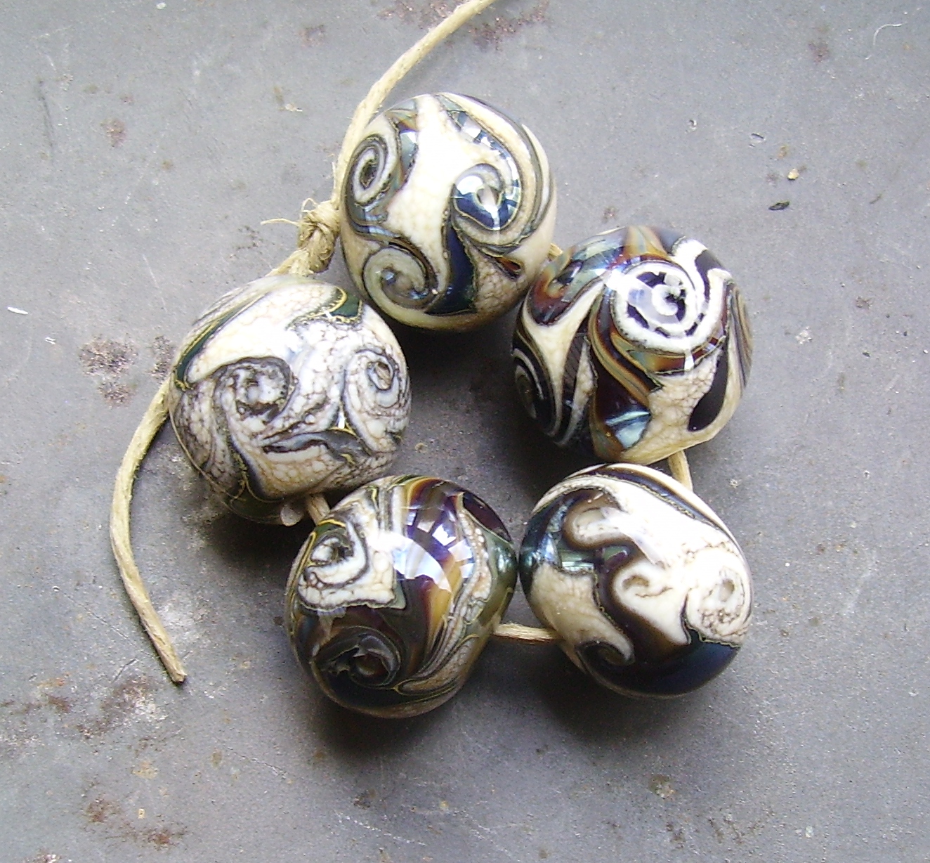
Creation is Messy just released a few opal greens and I couldn't resist giving them a try.  These beads aren't my usual run of testing each one against a variety of other glasses but I hope they show me what they are nonetheless.  All the opal greens have a similar blue-green hue.  Had to try them together.
 The base of this tabular bead is Effetre petroleum green and I layered CiM Rainforest, CiM Jade Palace and CiM Seafoam.  I really like it and may do something else along these lines soon.  I wanted to see how translucent these glasses remained and stacked them on black.  They all stayed pretty opal and I was thrilled to see the color was still perceptible.
 The base glass is CiM Tuxedo and I layered dots of Seafoam, Jade Palace and Rainforest, melted everything in and shaped.  I was pleased that the Seafoam stayed visible over the black and even more pleased that the black is still visible under 3 layers of opal glass, some cooked for quite a while.  Now on to see what they do on copper green.
 I loved the combination of copper green and Rainforest, so what about the other 2?  Hard to see the copper green under all that glass but it does the same cool separation thing it did with rainforest.  What I hadn't realized was that under the Seafoam, the copper green looks like it could be white.  On its own, all the blue-green in the copper green seems to have collected in a border on the edge.  It's easier to see on the edge of the bead.
 It's the bit not near the hole where it's grey but just on the edge of the pale green (which is Seafoam.)  I wanted to see if Seafoam did anything neat with Cranberry, which it doesn't unless you count just plain looking nice together.
The above bead was such a pleasant combination that I was determined to try out some rose cane one one of the opals and I picked Jade Palace.
 The roses are horrible and the Rainforest leaf is nearly imperceptible, but the combination bears further testing.  When I was holding the Seafoam, its similarity to Effetre nile green opalino was striking.  There the similarity ends.  As far as melting, piece of cake.  No shockiness, no burning nothing funny.
Comparing side by side beads that have been annealed, they are not at all alike.  The Seafoam stays translucent and is bluer and greyer.  The top bead is Nile green opalino and is effectively opaque.  I dug this small mystery bead out of my fun for the kiddies jar and while I have no idea what I made it with past copper leaf (maybe peacock green?)  the color match is pretty amazing.

Some really cool colors I look forward to playing with some more.

Saturday, October 8, 2011

Fascinating Effect

If you're looking for a bowl of bead soup click here.

Things have been a bit chaotic here the past week, with a surprise visit from my daughter and some of life's challenges, but I did manage to get a bit of time at the torch.  I had intended to make more Halloween beads with orange and purple and am still looking for the perfect purple.  EDP devitrifies too much to use and reacts with orange as well.  Evil Queen reduces to a bit of a metallic sheen and devitrifies a bit.  Ditto light silver plum (no surprise there) and Plum is too light and translucent and Mulberry is too dark.  I didn't even try Poi because I think it would grey out but I might as well.  You never know until you try.


 I did get a totally awesome effect with the EDP, though.  I think the 5-pointed star or flower effect is so cool and I love the way the orange faded.  The dark circle from the reaction makes this bead even cooler.  I wish the EDP hadn't devitrified so much.  It even made the black next to it bubble.
 Here's another view of the end.  I think this is so totally cool.  I wish I could figure out a way to use this bead so the end is out, since, sadly, the bead doesn't look like much from the side, where it would be seen with ordinary stringing.  Any ideas?

Sunday, October 2, 2011

Beads on the Table

If you're hungry for some bead soup, here's the link for the necklace I made with Hilary Frye's beads.  http://fire-in-ice.blogspot.com/2011/09/soups-on.html  To see the full list of participants, here's the complete list. 
I've been on an evil eye kick and this focal is one of the  beads I made in this style.
 The core is CiM Tuxedo, which is my official go-to black.  It's very black, doesn't pit or boil or go metallic or do anything else ugly.  And the price is about the same as the Italian blacks which do all of the above.  The white is Effetre because it really is a bit denser than the others and over black I really didn't want any translucency.  The aqua is CiM Pulsar just because I like it.
 Spacers, lots of spacers.  Oh, and another set of eyes.  Trying to get the small ones the same size gave me fits.  To make eye beads, I make a core of black and add large dots of white, melt it in, then add medium dots of blue and melt and small dots of more black and melt again, all the while trying to keep it round.  I finally discovered that if I flatten the bead slightly before adding the first layer of white it's easier to round out in the end.  I only wish I figured this out when I started.
 Halloween is around the corneer and I wanted to do a set in Victorian mourning colors because to me, they are so classic.  Who knew Effetre light grey separates on top of tux?  I used Vetrofond pearl grey for the large beads because that was what I had and was pleased with the match, but under black it goes a bit blue.  It does something weird with CiM Evil Queen, too.  Still, I think these are nice and Halloween-ey.
 And now for something completely different.  We've had nothing but clouds and rain for so long I'm seriously running out of patience.  These were, sadly, taken with artificial light because the watery light we've been having isn't cutting it.  The lime green is CiM Ephalba, the turquoise is CiM Smurfy (never do I buy Effetre turquoise again), the orange is Effetre light pumpkin and the purple is EDP.  It was a lucky break that the darker orange beads came out even but the "striking" of this color is impossible to predict.  I like the Effetre, I really do.  It's a nice orange when it doesn't go brown.  BTW, I tried EDP and pumpkin.  I got fantastic color out of the EDP without any devitrification at all, but the reaction with the orange is horrible.  Don't melt it in.  Trust me on this.