I'm gearing up for summer and it's watermelon bead time. I usually blend white with CiM cranberry to make the marbled pink for the flesh, but I have quite a bit of Effetre 456 gold pink and I wonder if I could substitute.
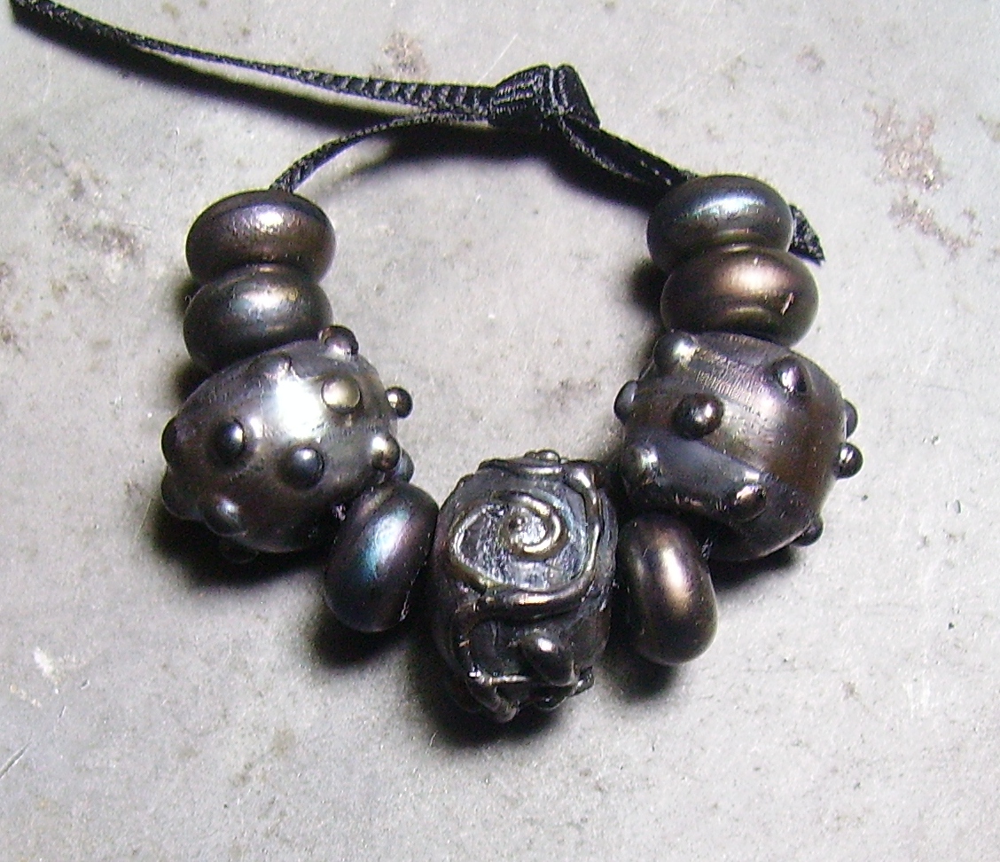
Probably not. My apologies for the mess on the left. The mandrels are numbered rather than the beads to avoid a wiring diagram of lines.
1--self spacers of my light batch of Effetre 456 on the left and a tiny bead of CiM cranberry on the right. It was the tail end of a very skinny rod.
2--456 over clear, cranberry over clear, and a self spacer of my DARK batch of 456. I only have one rod left but striking this dark I don't need more.
3--dark 456 over clear and white
4--pale 456 on the left and cranberry on the right. I think the colors over white show off the characteristics of each best. The light is very pale and streaky, kind of hard to strike. Making frit with this, it looks like a thin layer of 456 over a rod of clear. I'm sure this is my imagination. In comparison, both my cranberry and the dark batch are a uniform color all the way through. The dark 456 does show a bit of streaking, though.
5--light 456, cranberry, and dark 456 over white all on one bead. The dark 456 is almost a fuschia.
6--not that you'd ever know, but this is cranberry with dots of light 456 on the left and dark 456 on the right. Both burned but can't be seen on the dark background. My camera doesn't do well with a super light background. This is why I usually use a grey steel dish to photograph on.
7--this bead is half light 456 on the left and dark on the right, with dots of cranberry on both. It doesn't show up in the picture, but the cranberry actually burned a wee bit here. This is the only time I've seen this.
Here's a better view of the half and half bead, and while you still can't see the dots of cranberry the line where the light stops and the dark starts is very visible by looking at the mandrel.
Here's a closer view of the cranberry bead with 456 dots. I don't know that I can see the dots in this light (you can if you hold it up to the light at just...this...angle, which won't photograph at all) but the smudges of slightly burned bits show.
Here are some watermelon beads I'm working on and some from last year. I can't see any difference, and the batch of glass is very different. Pretty decently consistant on CiM's part, I think.
I couldn't remember if cranberry or 456 made halos around copper green so I made a mixed frit of both for these lentils. The 456 is the light batch.
To sum up, CiM cranberry seems more consistant, less likely to burn, and easier to strike than 456, but if I want a streaky transparent pink, I know which glass to use.