Pages


Sunday, February 28, 2010

Double Helix psyche

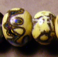
Double Helix has a truly amazing line of glass, which I have only begun to dip my fingers into.  It changes color, goes all metallic, shifts color depending on the light source and generally is impossible to exhaust the possibilities of.  It is also a bit tricky to work on a HotHead torch.  Naturally, I have bought all the colors I can afford.  I won't use this all up since as my technique and studio improves I will continue to make discoveries.  Like this one.  Thanks to Pat Frantz and her blog, I know that psyche likes ivories.  So I rounded up most of  the obvious ones I have and tried it out.  So what did I find out?  It is indeed possible to really strike this color, you just have to really turn up the gas.  I've been making the beads in a moderate flame, then finishing them off low in the flame.  This isn't enough.  I have to make the bead, heat it to soup, then let it cool to no longer any hint of glow and turn the flame way up and reduce it low in the flame.  Then I get iridescence, in fact I get color change!

1 psyche stringer on opal yellow, then 2 is opal yellow on psyche.  I like the rim on the edge of the opal yellow but I didn't get any webbing.  I wonder if this might have struck to pinkish a little in the reducing flame.

3 isVetrofond river rock, then 4 psyche with some very thin river rock webbing.  I like the webbing on the river rock, but the psyche doesn't strike very well right next to the ivory.

5 is Vetrofond dark ivory and psyche stringer, then 6 is the same reversed.  The color change on bead 5 is not as visible on this photo as I would like, and I was too low on gas to strike the psyche properly on 6 but this is not as obvious an effect as on the other beads. 
7 is psyche with silvered ivory stringer.  Because of the thinness of the stringer and the lack of striking next to it, the psyche only reduced on the ends, but this bead bears further investigation.  I have to learn to make thicker stringer.  I either melt it all over the place and it's crooked or I pull it too fast and thin.

8 is Effetre sediment with psyche stringer and 9 is the reverse.  I got some really cool greens and blues out of the psyche on 8 and was running out of gas and didn't properly strike 9.

10 is psyche stringer on Vetrofond E. L. O.  This didn't do as much cool stuff as I could have hoped, but I wasn't making a very large bead and didn't get as many cool effects as I could have with a larger mass of glass.

11 is CiM khaki with a twistie made of psyche and opal yellow.  You can't really see the khaki under all the twistie I piled on but there is quite a bit of separation of the khaki near the ends.  Next time I'll leave more khaki showing.

All of them reduced far better than any previous efforts.  My favorites are the ones where the psyche went greenish.  Green and purple is a great combination.  I didn't get a whole lot of the webbing, but on the river rock and E. L. O., I got a tiny bit on the edges of the stringer.  I think I needed to superheat it more, but to be frank, I'm worried about dripping glass all over the place so when it gets really liquid I remove it from the heat.  I wonder if prolonged heating at a slightly lower heat would do this?


To the left is a picture of my first attempt to do something with psyche, not very convincing.  The left bead is encased over clear and reduced a little and on the right is encased, which does nothing for it.  Check out the triton next to it, now that's dramatic.  I like psyche as decoration better.  I flatter myself to think I understand it a little better now.

Saturday, February 27, 2010

Vetrofond river rock

It's not really fair posting this, since there's no way of knowing if this color will be available, but I bought some on a frequent buyer program and was just itching to give it a run.  The rods are very big, about 9mm, and I was paranoid about shocking them, but, happily it seems to be a very easy color to work.  The rods are a toffee color and melt to a streakier opal yellow color if nothing is done to them.  Add just about any glass and stuff starts to happen.  I got 3 rods in the 1/4 lb., so 1 I'll play with, and the other 2 I'll save until I know what I am doing or I buy more.  And right from the start, I'll buy more if it becomes available.  This is what I thought dark ivory should be.  The beads:

1 is plain, really streaky if only at the ends.
2 is reduced, and I marked it with a dot of DH aurae just in case I couldn't tell the difference.  Reducing it seems to lighten it.
3 is with silver foil melted in and left alone.
4 is with silver foil, melted in, reduced and encased in vetro clear.  There are lilac, verdigris, and metallic silver tints that just don't show up on film.
5 is with DH triton scrolls, melted in and reduced.  The river rock seems to separate and swallow the triton like a dark ivory on steroids.
6 is essentially the same bead encased in clear.  A nice bead, but the same characteristics apply.
7 is with CiM tuxedo.  No real issues.  I meant to try this with intense black dots on dots.  Rats.  So many beads to make, so little time.  If it looks really neat I'll add it to this post.
8 is with copper green.  Aside from the obvious shaping issue, the predictable line between the 2 occurred.  What was a surprise was how the copper green lost its color.  No, this isn't the picture.
9 is with sis scrolls.
10 is with EDP scrolls.  I knew it was going to get ugly, but this goes all black and comes out the other side.
11 is with Reichenbach magic.  In this case, the blueblack that develops is attractive and accentuates the magic.  I don't know if I got as much out of this color as I could have, but I am happy overall with the result.
12 is with dark silver plum, and essentially all that happened is that the river rock tried to swallow the plum and went all separated.

What else is there to say about this color?  A lot, I'm sure, but nothing I can think of at this moment.  It acts like a super reactive super dark ivory that I am definitely glad I have in my repertoire and wish I had more of.

Friday, February 26, 2010

Effetre green dreemz

One of the dangerous things about Frantz Art Glass' site is they sometimes post yummie pictures of the beads.  Then I have to buy the glass to see what I can do.  This is one of those colors.  The swirls of darkness in the clear green.  Mesmerizing.  My results are pretty lame, but here goes:

1 is plain, 2 is encased over clear, with the streaks showing nicely.  3 is encased with clear, and the lightening of the color allowed the streaks to show a little, but I do like 4 over white better.  I didn't realize that the streaks were actually dark blue in green transparent.  You can just about catch this effect on the left side of the bead.  5 is with ivory and I'm happy to see it didn't do anything ugly.  6 is with copper green and there is a very slight lightening of the copper green where it touches the transparent.  7 is a disappointment.  The bead has a core of white, encased in green dreemz, triton decoration, reduced (too much) and encased again in clear.  I had to try it.  The last bead is essentially the same one without the encasement.  I like it better.  Still, this is a bit of lily gilding.  I think the best bead of the set is plain, over white, just the combination of the promo picture.  I wonder what it looks like over, say a very pale blue of yellow?

Thursday, February 25, 2010

Effetre whisper

Effetre whisper, looking very intriguing in the sample bead and pretty neat to add to my repertoire in general. It is nearly clear, with just a hint of gold pink, and a viscous quality that my cheap camera doesn't do justice to.

The first bead is just by itself. The second is reduced. I made it larger so I could tell the 2 apart in case the similarity was too great. No chance. 3 is with intense black dots, because I could see doing this. The black doesn't quite take over the bead. 4 is with copper red green. There is a red shift here, accentuated by the layering of whisper dots over the red. The green dots are more pronounced than this picture lets on. 5 is over ivory. I figured the color was a gold pink and this bead proves it. Still, because of the lack of intensity in the color this is an effect I might just use if it is reproducible. 6 is with EDP stringer. The EDP almost seemed to feed the whisper, even while it was being worked. I wonder what it would do with 456 rubino oro or veiled rubino? The last bead is with DH aurae, melted in and reduced. I was expecting it to go all yellow and wasn't surprised when it did. Would I do this on purpose on a bead? I don't know.

This is a neat color that I like the apparent viscosity of in the finished bead. How much I will use and whether I'll buy more if I run out I don't know. I'm glad I have some in my repertoire.

Tuesday, February 23, 2010

Will the real Lover Boy please stand up?

Torch chemistry is an astounding thing, since that is the only explanation I can come up with for this.  Effetre lover boy is a pastel that is billed as a lavender blue with pink streaks, and that is what it is in the test bead shown on Frantz Art Glass' site.  That was what I was expecting, not taking into account that she is using a oxypropane torch and has torch chemistry down to a science and I am using a HotHead and even if I knew how to control torch chemistry I would not be able to effect it much.  I know to work certain colors near the end of a cylinder and to turn the flame up or down on others but other than that it's up to the fire gods.What about this color?  Lavender blue? Not so much.  A very pretty color?  Definitely. 
First off, the initial melt.  It turned grey like a coral.  Not at all what I was expecting and it gave me a hint about how this color was going to react.  I don't know what Effetre had in mind, but I bet this was not it.  But I love it.  Embrace serendipity.
1 is plain.  Some lavender streaking near the ends.  Not very noticeable with my dinky bead.
2 is encased with clear.  The clear acts like a magnifying glass on this and it is a very pretty bead.
3 is with silver foil melted in.  Ahhh.  You're starting to get there.
4 is with silver foil, melted in and encased in clear.  I'm not sure if the picture really does justice to the bead.  It is really pretty, with pink and grey and black and silver and green.
5 is with copper red green.  I had to check a couple times to make sure I knew which end was which, but the left side is the lover boy.  Shoulda used plain copper green, but the cylinder was new and I didn't want to blow chunks of the very thick copper green rod all over the worktable.
6 is with ivory.  No reaction.  What ever this is, it isn't a gold or silver based color.  What is coral based on?
7 is with CiM tuxedo.    Nice separation on the pink.  I wonder what it does with intense black?
8 is with DH aurae, reduced and encased.  The aurae is very pretty.  The pink not so much, since there is a green  reaction just visible on the top left corner of this bead.  What is this color?
9 is with aurae, reduced and left unencased.  The pink is looking orange.  It's gotta be a coral.
10 is with plum silver scrolls, reheated gently.  Again orange.  It's gotta be something in the silver color.  But silver itself didn't do this.  Hmmmm.
11 is with EDP.  No reaction, and the combination is not specifically ugly, although I can't see using it. 

This color is indeed a mystery.  I like it a lot.  I will probably buy more if it is available when I run out.  I'll test it again before I try anything fancy on it, since experience is a great teacher, and by then I might know how to properly work this amazing pink.

CiM mink

This is a versatile color that I had to try but I can't see using much of.  A friend asked me if I could make some koala bear beads and this would be the perfect base color if I was capable of making sculptural stuff other than fish.
1 is plain, 2 over white, 3 over ivory, 4 with silver foil, melted in and 5 is the same, encased.  There is an attractive greenness to it that, naturally, doesn't show up well in this picture. 6 is with intense black dots, 7 is with copper green and 8 is with triton, melted in, partially reduced, and encased.  I like the only barely reduced part and wish I could have got more definition in the lines of triton.  9 is with triton, just reduced and 10 is with ivory stringer, melting all over the place as I tried to apply it.  I have to practice this some more.  It might be a good cow bead.  Actually, that is what this color is--the perfect Brown Swiss color.  Chocolate milk, anyone?

Right now I'm on a drama kick and it's hard to get excited over a neutral.  I'll look at these pictures again when I'm in a different mood.

Monday, February 22, 2010

CiM olive

I wanted another green in my palette for St. Patrick's day, and one that I have little of is olive.  For it I chose CiM olive, which Cim commando is no longer as close to in hue.  That being said, it is kinda close to Vetrofond's new wasabi, but different enough in at least the appearance of the rods that I won't have trouble telling them apart in my stash.  The rods are all shimmery and melt darker, which wasn't a surprise.  What was a surprise was hitting an air bubble and having the end pop off the rod.  It fell onto the worktable, didn't burn anything, including me and I banged the rod back in the flame without missing a beat.  The rest worked fine.

1 is plain.  Some streakiness here. 
2 is encased with vetro clear.  Did I smoke it?  I didn't think so....
3 is with silver foil.  I was disappointed that it didn't do more.
4 is with silver foil, melted in, reduced and encased.  I thought reducing it might do something but no dice.
5 is with poorly silvered ivory stringer.
6 is with Double Helix triton, melted in and reduced.
7 is with triton, melted in, reduced and encased.
8 is with ivory.  No reactions.  Rats.
9 is with copper green red.  I wanted some contrast, but the similarity in color value makes it hard to see detail.
10 is with CiM tuxedo.  Nothing happened with the black dots on the olive, but the olive separated on the black.
11 is as a rotten floral on black, encased in clear.  I need to work on this style of bead.  I should start larger to make it easier to get definition, with colors that I know will work well.
12 is with plum silver scrolls.
13 is with EDP.  I wanted to see what it would do to a gold pink, and the answer is nothing.

13 test beads.  It's a good thing I'm not superstitious.  It's a nice olive and will work well for leaves and such.  Will I be upset if I can't get any more?  Not really.

Sunday, February 21, 2010

Effetre sedona


Here's a color that I think is pretty, although others may disagree, Effetre sedona.  At its best its a complex light purple.  Purple.  What's not to love.  It does ugly things with silver.  I can live with this.  Here are the pix:  1 on its own.  2 encased. 3  with silver.  Did I mention it does ugly things with silver?  Now you know.  4 is with silver foil, melted in and encased.  Talk about wasting glass.  5 is with aurae, melted in and reduced.  See the comment for bead 3.  6 is same encased.  Why I thought this would make a difference I have no idea.  7 is  with ivory.  I was having complex heat and stringer control problems here, but I believe the general effect is that since sedona is a gold bearing glass it will not play nice with ivory.  That having been said, it did neat things in the one I did with sis on the separate picture, but that was intended to have a separate decoration.  8 is with copper green, and I do not believe I have had a color that shoves it to the back burner like this one did.  Wild.  9 is with CiM tuxedo.  Again, black is usually a color you have to be careful with.  Not so on this baby.  She holds her own.  10 is with metallic black scrolls.  One thing that is very difficult to do, with its tendency to devitrify, is "strike" metallic black, or plum silver, for that matter.

Still, a great color, and when my current stock runs out I will be buying more.  Did I mention I like purple?

Saturday, February 20, 2010

effetre metallic black

This is one that everyone but me knows how it looks and what it does, and has switched to dark silver plum or gunmetal to save on cost, but I had to do it. It is similar to dark silver plum in the lustre that it creates and the method I have to do it on my HotHead, but the tonality involved is very different in a subtle sort of way. Does that sentence make sense?
1 is by itself heated very gently for quite a while to really make it pearlize as much as it was going to.
2 is the same bead with dark silver plum scrolls. The plum predominates on the visual impact and this is the real difference.
3 is encased, and the pearly effect was lost, with no surprises all around.
4 is with copper green red and this is a beautiful bead. The color is like a moon on the water or something equally poetic. Just plain pretty.
5 is on top of Effetre intense blue. I still have some kinks to work out on my lentil press. Pressing the bead does accentuate the pearly process, which is what I was trying to find out.
6 is with triton and 7 is with aurae. They are supposed to be brother and sister and they seem to be on these beads. On 6 you have steel and on 7 you have purpley gold. On both beads, the pearl effect is extinguished where it comes in direct contact with the silver glass.
8 is with opal yellow stringer because the plain ivory was buried under a pile of other stringer. This says a lot about my worktable and something about the colors. The two aren't all that much alike, are they? Interesting zoo effect, though.
9 is with sis and all I can say about this bead is that it is prettier in real life. What was I thinking?
10 is on Effetre sedona as stringer. Getting the metallic black to do its thing while not devitrifying the sedona was no mean feat, and I like this color combination. A sucessful bead, all in all.
11 was with EDP stringer, and all I can say in my defense is that the EDP struck nicely. Getting the metallic black to go all pearly and not devitrifying the EDP is something I dare anyone to try.

Will I buy this glass again? Yes, when my current stock runs out. How much will I use? I don't know.

Friday, February 19, 2010

Effetre anice white again


I had to do this one again, since my results varied from the Mind Melt test batch so greatly.  In this case, I think my torch setup has more to do with my relative success with this color than anything else.  On the invoice it clearly states that it is shocky and the rods must be preheated.  This is a rarity and the only color I've seen this warning on so far.  So I had to go and see what it did.  I am used to working very carefully and introducing glass very, very slowly to the flame, since I am terrified of hot glass burning holes in me, or worse yet, the floor.  I started up very high in the flame and worked my way down.  No problem, not a single pop.  I think because the HotHead is much cooler than an oxypropane torch, I could get away with this.  Besides, I like the semitranslucent white.

1 is plain.  I didn't bother encasing this. 
2 is with silver foil melted in.  Nice yellowing, not what I was expecting at all.
3 is with silver foil melted in and encased in clear.  The yellowing was diluted.
4 is with DH triton, just melted in and reduced.  Not as much yellowing as I expected, based on my experience with CiM peace, which this glass superficially resembles.
5 is with triton, melted in, reduced and encased.  I didn't get as much color as I wanted on this side of the bead.
6 is with copper green red.  Again, more reddish than green, but I didn't really mind whatever I got.
7 is with CiM tuxedo.  There's a whole lot of webbing here, which was a surprise.
8 is with silvered ivory stringer, melted in.  This bead was a pleasant surprise.  It looks like some kind of jasper.  I might do a set of these.

The beads on the right were a set I wanted to do earrings with or something but couldn't get the millefiori to look right.  The grey bead is my favorite, but I haven't been able to do this since.  I might have badly burned or reduced the bead, or it might have been something weirder.  I just don't know.

Thursday, February 18, 2010

Effetre apple green pale

This one is a color that doesn't do it for everyone, but I happen to like this as a base for other things, and in the case of the dark bead, the neat thing it does with tuxedo and silver foil.  Kelp did the same thing and since kelp is about the same color, I think they may be different shades of the same color.  The first bead is plain.  One thing I'm noticing is that on the clear beads, no matter how I scrub the holes, there are bubbles in the glass along the mandrel that look like there's still bead release there.  Some of my opaque beads are so smooth that the inside of the holes has a mirror polish, but not the clear ones, naturally.  So ignore the white line through the center.  The 2nd bead is encased over clear and the 3rd is encased with clear.  I had to hold them over a white envelope on their sides to tell.  The 4th is with ivory and the 5th is my favorite, a base of tuxedo, with silver foil melted in, and encased in the apple green.  I tried this with light brown transparent, but no neat turquoise reaction.  I can't explain it.  The last 2 beads are with silver foil melted into the apple green transparent, on the last on its own and on the one before it encased in clear.  It turned brown but I thought it might.  Other than that, no fireworks.

I've been asking myself if I would buy more of this color and for this one, I want some to have but won't stock up for glass armageddon.

Wednesday, February 17, 2010

Effetre buttered popcorn (?)

I'm not so sure on the label on this color.  Did someone put the wrong label on the glass I got?  The rods look like an ordinary white, and melting this is like a CiM peace.  I did get a buttered popcorn effect on bead 2, but that was with silver foil melted in.  I'll go on to the pictures and come back to the name.

1 is plain.  I knew I wasn't getting any yellow streaks, so I struck it, reduced it, tried to strike it again, and nothing.  I'm not sure how the bead picture on Frantz Art Glass' catalog was made but it wasn't with my setup.
2 is with silver foil melted in.  There is a distinct yellow streakiness without any silvery character.  I wonder if this is how they did it.  Either that or I like too much butter on my popcorn.
3 is with silver foil melted in and encased in Vetrofond clear.  The yellow thing from the silver went all over the place.
4 is plain and encased with vetro clear.  Nothing.
5 is encased with Effetre light brown transparent.  I wondered if silver reactor glass might do something on this glass, and while the light brown looked lovely while it melted in, the finished bead didn't do much.
6 is me getting confused.  I thought I was going to try it with a color, any color, to see if it did anything and the only transparent to hand was Effetre pale green apple.  Why I thought this would help anything is beyond me.
7 is with Effetre intense black.  The popcorn dots separated in a cool way on the black.
8 is with Effetre dark turquoise.  The popcorn dots separated a bit but nothing reacted.  With more yellow to the tone, this would be a good substitute for ivory.  But not enough color to count.
9 is with Effetre ivory.  I can't say what happened with the annealing bubble sticking to the ivory.  Apparently it was no longer glowing and firm enough not to move but far from set.
10 is with Effetre copper green.  At least this bead is shaped more attractively.
11 is with DH aurae, melted in, reduced and encased in clear.  This isn't doing anything for me.  It goes in the reject bin.  Pretty soon I'll be able to start my own bead curtain.
12 is with aurae again, melted in and reduced.  The aurae is a pretty gold here, at least.
13 is with dark silver plum scrolls. 
14 is with EDP scrolls.

So, where do I think the name came from?  I believe there is either a different batch, or simply this color isn't meant to be worked on my setup.  I can't work anything in an oxidizing flame, so maybe that has something to do with it.  Maybe the size of the bead makes a difference, because I do tend to work small.  I'll stick this back in the glass stash and see if anything changes over time.

Tuesday, February 16, 2010

Effetre yellow opal

Today is Mardi Gras, which we all know means beads!  So, I am allowing myself 2 posts.  This color has been haunting me since I want to explore its unique place in the color spectrum.  The rods are an unassuming beigey yellow, and the beads work up to, surprisingly enough, about the same color.  But what a color.  I've been working with all kinds of colors, be they beige, pink, yellow, purple, green, or whatever.  This one thrills me.  Not because it does anything spectacular, but because it is.  I got CiM stoneground because it was supposed to be close to it, but it really isn't.  I may wind up using stoneground more, because it does neat things with silver that yellow opal doesn't.  What this color does is fill a unique place in my spectrum.  Frankly, the price will keep me down to using a moderate amount of it, but this is the yellow I've been searching for.  OK,enouth raving, here are the beads.
1 is plain and unencased.
2 is encased with effetre clear.  There is a pink tinge to the encased beads which I think is a characteristic of effetre super clear.  I'll roll with it for now.
3 is with silver foil, melted down and encased in effetre clear.
4 is with silver foil, melted in.  I was surprised that it didn't maintain more of a silver character.
5 is with DH aurae, melted in somewhat and reduced.  This is gold.
6 is with aurae, melted in, reduced, and encased with super clear.  Not quite the purplish reaction I was expecting.
7 is with SIS.
8 is with ivory.
9 is with CiM hades.  The black doesn't spread as much as I thought it would.  Is OY a spreader?
10 is with effetre dark turquoise 236.  Yep, it is.
11 is with copper green red.  I like that the copper green red remained in its red phase for this one.  I don't know how I would have dealt with green, which is why I din't go with the plain version of copper green.  There is a faint grey line on the turquoise, so I think it would have done a pale imitation of this, snce it tried to on the copper green red, but I don't know.   I don't know if I'll find out, since I like this combination.
Finally, 12 is with plum silver dark.  Just because.  The plum silver was tough to set, but this was not unexpected because my torch seems to be running hot and the "easy" colors are getting tougher.

Will I buy this color agan?  Yes, because I like it.

CiM chai unique

Now this color I'm much happier about.  Chai:  a tea based beverage infused with spices and full of sweet milky goodness.  The color isn't like any tea I've ever brewed, and I've brewed a few batches of chai, but the color is nice.  This unique is a pink reminiscent of CiM desert pink, which is bead 11, but I precede myself.
1 is plain, unencased.
2 is encased with effetre super clear.
3 is with silver foil melted in.  I can't quite show the texture in this picture.  The color is very nice indeed, but the texture reminds me of something nasty.
4 is with silver foil, melted in and encased with super clear.  Interestingly enough, the silver reaction was subdued as I encased it.  This was actually visible as I encased the bead.  I've never had this happen before.   It was as if the encasement sank the silver into the depths of the bead.
5 is with triton, melted in and reduced.  Something brown happened to the pink, and while it is more true to the color of chai, the beverage, I'm not sure I like it in this color.
6 is with aurae (OK, I ran out of triton stringer or I would have used that) melted in, reduced and encased in super clear.  There is a distinct muddiness which I can't say I care for.
7 is with ivory.  Seashell beads, anyone?  No reaction and neat color combo.
8 is with copper green red.  One bad thing about photo software is that it can't do everything for you.  This bead has tones of green and blue that are not visible in my picture and any efforts to emphasize these characteristics made the rest of the pictures nasty.  Trust me, it looks better in real life than it does here.
9 is with turquoise.  I never noticed how much the turquoise spreads before.  I wish it didn't, since this color combo looks nice in real life.
10 is with CiM hades.  I know this spreads.  If I were to want to make a bead with this combo, which is very attractive, I would have to pay very careful attention to this characteristic. 
11, again, is CiM desert pink, which is ever so close to this color.  In fact, let me post the whole review.
I won't bore by reposting what I already did, but there is a lot of similarity.  There is a little separation on the hades bead which I didn't catch before, though.

My overall impression is that I would buy this color again, if it were available.  It is a nice shade of tawny pink.  It works for me.

Monday, February 15, 2010

Effetre yellow ochre

I'll be honest from the start, mustard yellow is not my favorite color, and this is an absolutely perfect yellow mustard ready to go on the hot dog color. It held no surprises as far as my expectations go, and I was not even tempted to get out the silver glass for it, although I bet it does that purple thing I like. I just can't work up the enthusiasm. I have a quarter pound, and I have used about 1/3 of a rod. I will probably still have that amount next year at this time. Negative enough? It's not the glass. It's me.
1 is plain and unencased.
2 is plain and encased with Effetre clear. Like mustard, it remains vivid even when diluted.
3 is with silver foil, melted in. I think this is the most attractive bead of the bunch, primarily because it is covered in silver and has a neat texture.
4 is with silver foil, melted in and encased in Effetre super clear. The same rod that was giving me problems. Figures on the color I don't like it has no scum. I must have got past the dodgy part. I don't like this as much as unencased because the texture is no longer there.
5 is with Effetre dark turquoise. The grey line making an outline around each of the components is there, was expected, and may be the only reason I use this glass. I have seen some nice work with this color combination, notably by Mike Poole. My stringer placement is horrible, which Mr. Poole's is anything but.
6 is with copper green. I hate to waste copper green since it's such a fabulous color and I didn't get anything I didn't expect, but this bead is neat in that the yellow goes sort of orangeish where it contacts the green on the dots only, not the green on the orange.
7 is with ivory. Nothing earth shattering here. The ivory bleeds and the yellow "stains" it.
8 is with CiM hades. Hades spreads. A lot. This is good in this case, since, in case I didn't mention it, I'm not overly fond of this color and I like black much better. No nasty reactions, though.
Finally, 9 is with plum silver dark stringer, almost entirely melted in and reheated gently to bring out an iridescence on the plum. It looks almost black. I don't know what I was hoping for.

My overall impression is that I am perfectly content with the quantity of this glass that I have. I may use it in combination with turquoise or copper green if I decide I need that look for a piece of jewelry that I have to make to get it out of my head but I will probably not buy more of this color. I had to try it, I did, and now I don't have to any more.

Sunday, February 14, 2010

Happy Valentines Day


Happy Valentines Day. Today's post will be short since I'm devoting the evening to my Valentine. Joe isn't too crazy about my glass addiction with the noise of the torch and my complete absorption in working so I'll give him tonight and work like crazy tomorrow. This is a picture of him in his SCA garb at Victorian Days demo in Belvidere, NJ. In the first picture he's hard at work smithing and in the second he's mugging for the camera and loving every minute of it. He made the axe and the arrow, which he mounted and fletched at the site. If it is a Victorian demo why is he dressed in garb circa 900 A.D.? The SCA was invited and that is the time period they cover.

Saturday, February 13, 2010

Vetrofond E.L.O.

A brand new color from Vetrofond! Frantz Art Glass calls it E. L. O. for extra light olive. My initial impression on viewing it in the rod form was that it was similar to CiM dirty martini. Not so much. Upon using it, I have come to the conclusion that it was an ivory that didn't turn out the way they thought it was going to. From that I'll go on to the bead pix because they say it all.

1 is plain spacer. If it were sitting on the table by itself I would think it was ivory.
2 is encased with Effetre super clear and I am still thinking ivory, even more so with the pinkish tone that seems to have occured with encasement.
3 is with silver foil melted in
4 is with silver foil melted in and encased.
5 is with turquoise. Note the grey line. I should have photographed my turquoise and ivory test bead for comparison.
6 is with intense black. I think it is interesting that the black remains crisp and clear and the ELO is curdled on top of it, kinda like ivory.
7 is with ivory, half ivory and half ELO, dots of each upon the other. With the lousy picture I took, the two are fairly indistinguishable.
8 is with dirty martini, separated with SIS, since the rods looked so much alike. Melted, they look very different. This says a lot about my skills in stringer application, but even more about how the finished bead will look. Look at it when it melts.
9 is with DH triton, encased in clear. Not much to look at, is it?
10 is with triton, on its own and reduced. The ELO goes yellowish, like ivory will in contact with silver. I believe this is indeed an ivory variant.

My overall impression: the jury is out. It is a nice color and I may find something that it does better than anything else, but for my money I'll take the other colors if I can save a few pennies. It isn't distinguished enough to make sure I always have some on hand.

Friday, February 12, 2010

CiM glacier

Featured today is CiM glacier. I'll confess, I am a sponge for ideas and like to play with them. Dragonjools posted on this a while ago and I was impressed with the possibilities in this color. Bead 3, for instance, is my take on her weird result. Being a devout self teacher, which is a good thing since I don't have access to anyone to teach me except once a year, I had to play with this.
Bead 1 is a self spacer, pretty plain and boring. The color is too grey to be appealing to me and isn't even really shiny. I got the shape a little better on
Bead 2. This is encased with Effetre clear, the same rod I've been having problems with since I'm too cheap to change rods before I've used the first up. There isn't a lot of scumming on this one, but I don't know if this is because I got past the bad part or because I managed a relatively thin layer this time and there isn't a lot of clear to scum up.
3 is the reason I got this color in the first place. I love reactions between colors and wanted to replicate this and see what else it would do. I didn't get exactly the same effect Dragonjools did but I think my glacier dots on top are a lot larger and I don't have the stringer control she does.
4 is on ivory and the blue dots on top just sort of disappear. I'm noticing this color is another one that gets lighter on contact with other colors rather than under encasement. Please ignore the stringcutter spike on the end. I'll file that down because it annoys me.
5 is with yellow and white twistie. I wanted to see if glacier acted like sky blue or turquoise when combined with yellow. When I started this bead, I realized that I didn't have any yellow stringer to hand and did have the twistie, hence I tested yellow and white at the same time. Now I know that glacier acts more like a periwinkle.
6 is probably my favorite of the bunch, combined with copper green. What an Easter egg kind of combination. I like periwinkle and mint. For me, this works. No reactions, but I don't think I would have liked them in this case anyway. The glacier dots on the copper green are invisible in the picture, but not in the bead.
7 is with triton, melted in, reduced and encased. I didn't do a good job of reducing the triton with the dropping gas pressure, so I am not surprised that I didn't get many neat color effects. What did surprise me was that the yellowing reaction with the silver glass happened on the plain portions of the bead but not the encased ones.
8 is with reduced triton, unencased, and the yellow thing happened here. I don't like this effect, I'm sorry to say, and I wish they could come up with a periwinkle tone that didn't do this. If I wanted greenish I would have used green glass.
9 is with EDP scrolls, melted in. I was still thinking spring and wanted to see what would happen with the Easter egg in mind. The EDP spreads a lot, doesn't it? Note the lightening of the glacier in the areas it is in contact with the EDP.

My overall impression of this color: I'm glad I have it because I like the combination with copper green and will continue to play with its reaction with black. I may or may not get more. Easter is coming. I wonder what it does with crocus?

Thursday, February 11, 2010

Spanish leather

About time I got something up on the new colors.  This one is one that intrigued me ever since I tried to get it as an inexpensive conicle, or pulled rod end, and found it had sold out.  Imagine what that would have been like, considering its normally shocky nature.  As it was, I did have the end of the rod pop off once, but that was due to my impatience rather than the glass, which I found to be reasonably stable, if very soupy when hot.  Even with the gas pressure in my cylinder running low, I was able to get it moving on the mandrel easily, so much so that I had a hard time gravity shaping these rounds.

On to the color itself.  I think it is a member of the large and extended coral family from Effetre.  It goes grey when hot and to judge by the reactions with the colors I tested, seems to act the same way. 
Beads 1 and 8 are plain self spacers.  1 was barely shaped, if at all, since the doorbell rang as I was starting what was meant to be a test bead with black.  I like the red line from the unstruck glass.  The test bead with black will be made at some point.
8 is the same bead, which was made first, but melted round and fire polished.  I like 1 better. 
2 is with silver foil melted in and going black and beaded.  I wonder how this would look as a silvered stringer on a black bead. 
3 is with silver foil, melted in and encased in Effetre super clear, which seems to have a scumming problem in the current rod I am using, since it did this on the other encased beads I did on this rod and not the one before.  It's not doing anything for me.
4 is with DH aurae just about melted in and reduced.
5 is another surprise: aurae again, left a little raised, reduced and encased in that same clear rod again.  I need to get a different rod out and see if things improve.  I got that purple reaction again.  I wish I could predict this, since I really like this shade of purple.  I wonder what would happen if I entirely encased a bead of Spanish leather with aurae.  I can't get more of the zucca chiaro, but can get Spanish leather.  Hmmmm.
6 is with copper green and there is a faint dark reaction line on the Spanish leather.  I don't know that I would ever use this combination, since it was better in my mind than it turned out in the bead.
7 us with Effetre ivory.  I expected the Spanish leather to bleed, or the ivory, and to my surprise, neither did.  This is good to know.

My overall impression of this color is that I will buy it again.  I like it on its own, since it is a warm, woody, streaky earth tone, even if it is a little more than a little soft.  I like the unencased silver foil bead and what it does with aurae I will be exploring further.  I love the idea that it is hand pulled, but the likely reason that it is no longer available as a conicle is that it will come out next in a machine version.  I don't know if this is necessarily a bad thing, since machine pulled glass tends to be cheaper.  Cheaper isn't necessarily better, though.  I deleted the rant I was going into.  I like this color and will use it again, probably a lot.

Wednesday, February 10, 2010

strawberry pink

 These earrings I made using the newer version of Vetrofond strawberry sweet odd lot and rose cane with Effetre pale pink special and Vetrofond arancino perfecto odd.  They were just listed on Etsy as I can't resist this style of earring. I also like the different tone produced by using different colors in the rose, though this isn't quite the peach I was looking for.  Maybe the banana cream for the opaque?  I need a pale yellow and don't want to use ivory because of the potential reactions.
 Quite a difference between the 2 batches of strawberry sweet.  The first makes a good earthtone and the second, in the picture below, seems more of a pinkish coral in the bead, if not the rod.  In the small beads this is not as apparent, but I wasn't building up as large a bead as with the lower one and the inner layers didn't come up.  Both look different in rod and bead form and both are unusual shades of pink.  What else to say?  I am keeping a little of both lots, since this color looks like it's going to vary a lot and who knows what's going to come in next time I order this glass.
I've been working on getting test beads for more colors, but my attention seems to be wandering from one color to the next and don't seem to want to do too much of one color on the 30 minutes or so I have on the torch before the gas cylinder frosts up and the pressure drops to the point where I worry about the flame staying hot enough to work or even going out in the middle of a bead.  This is a problem I seem to be having a lot as I try to stretch out my working time.  Cindy Jenkins suggests switching tanks or immersing the bottom in warm water but the prospect of gripping the hot Hothead and putting it on a fresh cylinder doesn't appeal any more than sitting with a bucket of warm water between my knees to soak the bottom of the tank.  Either way threre's going to be some sort of accident.

Monday, February 8, 2010

new earrings

Not being satisfied with only trying one way of doing things, I had to go and modify the rose cane I think I finally got the hang of.  Who says roses have to be red, or pink, or whatever.  The concept of peach roses appeals, especially to include some of the coral tones, but first I had to do blue.  There is no such thing as a true blue rose.  This cane is made from white and CiM simply berry, layered instead of just encased.  I like how complex the flowers seem.  I will do this again.  The base is Effetre alexandrite special, to capture some of the lavender blue color shift.  These were just listed on Etsy.
I need to do some work on backgrounds.  Right now I'm just using a piece of white cloth and a dished steel candleholder because I like the contrast with the glass.  Some folks like to use paper or other stuff they have lying around.  I know, after my photography session that highly reflective surfaces don't work, and I see this to some effect with the white cloth.  It tends to make the brightness and contrast hard to adjust.  More experiments to come when I get a chance.

Sunday, February 7, 2010

flowers and snow

Here is a pair of delicate silver earrings of CiM dirty martini with rose and leaf decoration I just listed on etsy.  I was very happy with how they turned out and had to list them with or without a decent photograph.  I will eventually get around to sorting out the stuff I was doing yesterday while the mid-Atlantic region was getting pounded with snow.  My thoughts are with my friends in the area and how they made out.  In NJ, we did get a blizzard every couple of years, but generally it was along the lines of "remember that storm in '94 when we got 35"?"  And then you spend the rest of your lunch hour arguing about whether it was '93 or '94, or was it '95, and how many inches were bestowed on the area of the state we were in.  Here 3 feet of snow is still a major drag but the area infrastructure is more prepared to deal with it.

Sorry, guys.  We'll get it next time, promise.  Hope everyone enjoys the Super Bowl today.

Saturday, February 6, 2010

hearts and flowers today

 Valentines Day is coming and in celebration of this tribute to candy companies and jewelry merchants, I am making beads devoted to hearts and flowers.  I am happy to report that I have had some success, at least as far as I am concerned, with this.  The first bead on the mandrel is a case in point.  Effetre copper green red, with leaf and rose designs.  The shape of the bead may be a little off the perfect donut but the roses came out very nice, and the leaves are well shaped, too.  Could I be getting better at stringer control?  Probably the law of averages and dumb luck.  The other 2 beads on this mandrel are of the pinker version of strawberry sweet with the same rose cane and leaf stringer application, not quite as successfully.  I think the strawberry sweet, while pinker than the downright earthy version I got initially, is still too orange to not clash with the pink roses.  Next experiment:  peach colored roses.  This is acually why the lower picture exists, since the flash I used  really brings out the orange in stark detail.
On the right is my very first heart bead, made with Effetre rosewood.  I really like this bead.  The indentation on the top of the heart is not as pronounced as it could be, but the other side is deeper and I really like the color swirls on this side.  I'm more into color than hearts.  I haven't tried to make a horizontal hole heart but I imagine the overall process is about the same.  Kind of like glass sculpture for dummies.  I wonder if this book is out yet.  If not I'll have to copyright the name before anyone else thinks of it.
A few posts back I threatened to do a comparison between the machine pulled version of silver plum dark and the handpulled version.  Surprisingly enough, they do act the same.  The bead on the left is the machine pulled version, and the one on the right is the one made from the few rods of hand pulled conicle that I have lying around and I got cheap.  The reason it is not pearlized as much as the machine pulled version is that right around when I was making this bead was when I noticed the crockpot starting to smoke, and voila!  This bead was done.  I normally don't use a flash for the pictures that I am posting because it makes the colors all washed out and distorted, but in this case, it really brings out the lustre on the beads.

Friday, February 5, 2010

shoulda stayed in bed

 I decided to do something for Valentines day so I made a big pink bead.  It measures about an inch in diameter by about an inch and a half in length.  It has pink rose cane marks on it.  It has green blobs that were meant to be leaves.    It didn't crack.  This is about all I can say about it.  One of my coworkers said she liked it for the color, CiM desert pink.  The others hated it, because it rots.  I have fairly good stringer placement, if not control, and that is all I can say good about this.  More experimenting is in order on the rose cane.  I think it will work for blended stringer, but it doesn't much look like a rose.  It's kind of like those flower pictures your kids give you.  Oh...how pretty...is that a flower.....
Let it be known that if you forget to turn off your crockpot at night and then go to work at 5:00 in the morning, leaving it on because you thought it was off, come home to an intact place of dwelling, and smell it burning after you have your stuff done for the night you should count yourself lucky.  I am.  The dark marks on the side are soot marks from where it didn't quite catch fire.  What else can I say about today?  I should have stayed in bed.

CiM tamarind unique

CiM tamarind unique 1 looked sort of shimmery in the rod form but more of a mud color in the bead.  Aside from the shaping issues in the first bead, this plain bead developed a neat blush, for lack of a better word, with striking.  The second bead is with silver foil melted in, which went sort of greenish yellow as is so plainly not shown in the picture.  This effect was entirely lost in the third bead, which is melted in silver foil and encased - fairly well, for me - in clear.  I like the way tamarind separated in the next bead, combined with CiM hades.  The black spread a little but I'm beginning to expect this with this color.  With ivory, no reaction and the colors behaved like good children and kept to their own side of the seat.  The copper green bead next up looks more turquoise than copper but this is consistent and creamy, so if it is a reaction I would expect it not to be so uniform.  Maybe it's a function of how I heated the green.  The last bead is TE-362 stringer on tamarind, which looks pretty indistinguishable, melted in and given my best effort at striking without reducing to oblivion.  Sort of a swirly irridescent quality without any definite lines of demarcation.  Different without being distinctive.

My general impression of this color is of a more or less bland base for other things to happen on and around.  I like the effect of the silver foil melted into the bead and left unencased, but unless I can get it to photograph well on its own it just doesn't show up well here.  It plays nice with ivory, may change the appearance of copper colors, and separates with hades.

Thursday, February 4, 2010

CiM cranberry dark and CiM rose quartz

I've determined to get over myself so what follows are my result with some of my new colors.  First up, from CiM, cranberry pink unique-2, dark.  I really like this color, if for no other reason than I can't cook it no matter how hard I try.  No livery spots, no butterscotch, it's idiot-proof, in other words, me-proof.  The first bead on the left is plain, and admittedly underworked because I was worried about burning it.  The second is encased with clear.  This one I did heat a lot, and no change.  The third, encased over clear, and I did not melt it in as far as I could have but the color still struck.  The next was encased over white, and since I didn't reheat it as far as I could have I was worried about it striking.  No worries.  Next up is with silver glass; aurae on the left and triton on the right.  Looks good but I like the aurae better than the triton.  Must try this again and really see what it does.  Ivory over cranberry.  I wanted to see if the ugly gold pink reaction happened.  I think it did, but underneath the ivory so it can't be seen.  Black over cranberry.  Not a lot of contrast, but cranberry is dark.  Plum silver dark stringer on cranberry.  I thought this might look nice.  Copper green and cranberry.  Funny, I thought something dramatic would happen.  The cranberry is saturated enough to show up on the copper, though, which is worth noting.  TE-362 stringer on it, which doesn't show up well on this photo.  This is supposed to be a ruby color and I think it sort of does this.  Last up is EDP on cranberry, just because.  I don't like this color combination and knew it wouldn't react.  Why did I make this bead?  No idea.
CiM rose quartz original.  I got a unique version of this originally, and like it for encasing since the color is not as reactive as the Effetre pinks and neither is it as peachy.  But you can work it to kingdom come and it doesn't really get the translucency that is one of the hallmarks of this color.  The unique is sort of more of a blush.  This I like more but I think I have enough pinks now for a while, but don't quote me.  The first bead on the mandrel is a self spacer.  The second is encased in clear.  The third is over white, and it is interesting to note that the translucency is still visible even with the thinness of the application.  The fourth bead was a pleasant surprise.  This is with copper green and there is no wierdness, and the dots of pink on green are still visible.  The 5th bead is with triton stringer, reduced and encased in clear.  The triton went all greenish, which looks nice on the pink.  The 6th bead is a poorly shaped bead with vetrofond dark ivory.  I was expecting some kind of dramatic, ugly reaction and nothing happened.  This is good to know.  The pink spots on the ivory are nearly invisible, though.  The EDP on the 7th bead sort of spread over everything and it's hard to see the rose quartz underneath.  That having been said I would like to try this again with finer stringer.  The second bead from the right is mixed with CiM hades and hades didn't seem to spread as much as it did on the desert pink.  But the pink disappeared when applied over the black.  The last bead on the mandrel is one I knew I was going to like, with aurae stringer, reduced.  I must say I will buy both these colors again.

Wednesday, February 3, 2010

Online venting and wish list

 My frustrations today have been mounting.  I had a small health crisis this morning with an esophageal disorder I obtained 15 years ago as a result of not following the instructions on a prescription medication.  That having been sorted out I spent the morning trying to get in touch with the various medical providers and gatekeepers in my life.  I discovered much to my chagrin that I deleted the photo I've been using to log into people's sites and had to find a way to fix this.  I finally decided to just let what will be be and do beads.  My crockpot arrangement is working beautifully for the smallish beads I've been doing but I wish I could coax more out of my silver colors.  Per Double Helix the secret to using Caliope, Terra2, and Terra lite is to heat it to heck and cool, then reheat and I am not able to do this with my puny little hothead. 
 My apartment has rules against propane tanks for grills so they will not tolerate someone using a dual fuel torch on their premises, I'm fairly certain.  Moving is not an option, since I still haven't found a lot of the stuff I lost last time I moved.  I could possibly set up a studio in Joe's shop if I could clear out a corner and run electricity to it.  Did I mention it is unheated and we live in central NY?  and it's winter.  So this is my blog to vent my frustrations at the world in general.  Above is a Nortel mega minor that would allow me to fine tune the results from the glasses I would like to use, and to use boro glass, which I know won't work on a HH.  To the right is an oxygen concentrator that is not strictly necessary since tanked O2 is available wherever welding supplies are sold.  Below is the kiln I would like to get and which represents the only short term possibility on my wish list.  All I have to do is stop buying every darn glass that comes out and save up a couple bucks.
Please ignore this spate of negativity.  Today has been a rough day.  More bead pix tomorrow and my favorite show is on tonight.